You know how they say you can judge someone by their shoes? It’s often the little things that let us down. FTSE 100 corporate sites tend to be big and complex to match the organisations they serve, but can be seriously underpowered when it all goes wrong.
Being presented with a 404 page is irritating at the best of times, but there are different ways of handling this, and – predictably enough – the FTSE 100 demonstrate the full range of options available.
Tip One: provide a 404 page
A few sites (about 10%) send the visitor to the home page, or to the last known page, when there is an error. This does have the benefit of keeping them on the site, and letting them try again, but it can be a bit disconcerting when it looks as though you haven’t gone anywhere.
Two sites present an Under Construction page, which seems to me to be a bit of a copout. The page isn’t under construction: either the visitor typed the wrong address, or the site is broken.
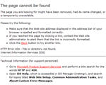
And then there’s the standard 404, which everyone has seen, and about 50% of the FTSE 100 use. It varies a little (sometimes it is provided by the hosting company, in which case it carries their logo and details, sometimes it is just a white page saying 404 Page Not Found) but it is never helpful.
If you get this, there is nothing to do except go back or go elsewhere.
Tip Two: apply the corporate branding
The next step up is to add the corporate branding to the 404 page. Sometimes this is just the logo and the coloured topbar, with a suggestion that the visitor presses the back button on their browser. Not very helpful, but at least the visitor knows that they are still on www.majorcorporate.com.
Occasionally, sites provide a couple of links as well, such as a link to Contact Us, or to Home. This is a slight improvement, but really isn’t enough.
Tip Three: provide the full site navigation
At least two sites provide some navigation, but put the 404 page in the Site Services section, which means that the visitor is given the site services navigation only. They could then get to the privacy statement, or the disclaimer, but doesn’t really put them back on the right track.
I think that adding the main site navigation to the 404 page is very helpful, as it enables the visitor to have a guess at where the page might be found, and at least gives them an option other than to click ‘Back’ or leave.
Give them the top navigation and the side navigation. If you’ve got two sidebars – give them both.
Tip Four: provide the sitemap
About 7 sites provided a link to their sitemap. This is helpful because it means the visitor has a strong chance of finding the page they were looking for.
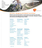
One site (GlaxoSmithKline) provided not a link to the sitemap, but the sitemap itself, on the 404 page. This is unique in the FTSE 100, as far as I can tell. Their 404 is clearly branded, contains all the links available, and the main top navigation as well (including search and quicklinks).
Tip Five: provide a search function
So the visitor got lost somehow? Why not give them the chance to search directly for the topic that interests them?
Don’t just provide a link to the search function, as most do (or, as in one case, tell the visitor to search using the – nonexistent – search function above); put the search box on the 404 page. Why not?
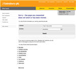
Better, provide a search function with filters, as Sainsbury do, so that the visitor can narrow down their search results.
But do tell the visitor that this is a 404 page. One site we found simply presented the visitor with a search function, but no explanation as to why – and certainly no apology for the missing page.
Tip Six: be nice
How do you feel when a 404 page tells you that you made a mistake? Chances are that it wasn’t you at all, but www.majorcorporate.com that made the mistake. If Major Corporate says I must have mistyped a URL, when I know full well I fell into the 404 trap following one of their links, I am quite likely to have (one-sided) words with my PC.
We suggest apologising to the visitor (even if it wasn’t your fault) and offering them options for getting out of the problem page, as above.
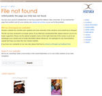
Although it doesn’t have all the bells and whistles I’ve suggested, I found the Xstrata 404 page to be very pleasing. The screenshot doesn’t do it justice, but the highlighted yellow section fades after a few seconds – a neat trick not usually seen on corporate sites. And note how they provide images that link to their annual reports. An image in the main content section of a 404 is very rare.
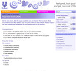
A couple of 404 pages we found looked distinctly unloved, with broken or missing links, but some sites, such as Unilever, handle an error very smoothly, allowing the visitor – and the site – to recover without significant loss of dignity.
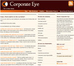
How does your site compare? Ours looks like this – but of course you can test that for yourself.
Lucy is Editor at Corporate Eye
Hi Matt – thanks for visiting.
Yes, I like that, and I think you’ve got very graceful exit options (search, full nav, useful links, branding, etc). And I love the header.
Do you think it’s easier for those of us who’ve built their sites on WordPress to provide a cleaner 404? I’ve identified some good 404’s above, but there are a lot that are significantly less helpful.
I think my 404 handles the problem gracefully. I give the user the option of returning to the home page, point out the pages navigation menu at top, and point out a site search box. I also list the last 10 posts to the blog. Have a look: tuleydocs.com/oops
Great post. Having a good 404 is essential, and can even mean you get some media coverage (like this, for example).
Thanks Andy. I suppose you’re right about the media coverage too – though I don’t know how many of these major corporates actually track blog mentions. They should!