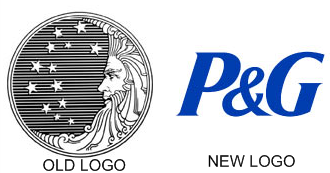
What would people think of the Procter and Gamble brand if the company still used its original logo created when the company launched in 1951? Take a look at the original logo compared to the current logo below.

The original logo is about as antique-looking as a company can get as far as logo design goes, but would you be surprised to know that this logo was used until the 1980s? That was when rumors started flying that the image in the logo of the man in the moon looking over 13 stars representing the original 13 colonies of the United States was actually wrought with satanic symbolism, including at least one hidden “666” in the curly beard.
Still, Procter & Gamble fought the satanic symbolism rumors until finally in the 1990s they removed the beard graphic and later moved from a graphic logo to a wordmark using just the P&G that the company has become known as in the 21st century.
Little did P&G know nearly two decades ago when the company finally changed its logo that it would be one of the best things it could do in terms of building its brand. The P&G logo and brand name today are far stronger than the old name and logo were. Of course, Procter & Gamble and P&G will always mean the same thing, but in a world of Web 2.0, when people are busy and looking for shortcuts everywhere, it’s great to see a brand story that could have been damaging turn out better than anyone could have hoped.
It just goes to show that rebranding can work, even when it’s not done by choice. Sometimes a brand just needs to be updated or needs a kick in the pants, so to speak.
Susan Gunelius is the author of 10 marketing, social media, branding, copywriting, and technology books, and she is President & CEO of KeySplash Creative, Inc., a marketing communications company. She also owns Women on Business, an award-wining blog for business women. She is a featured columnist for Entrepreneur.com and Forbes.com, and her marketing-related articles have appeared on websites such as MSNBC.com, BusinessWeek.com, TodayShow.com, and more.
She has over 20 years of experience in the marketing field having spent the first decade of her career directing marketing programs for some of the largest companies in the world, including divisions of AT&T and HSBC. Today, her clients include large and small companies around the world and household brands like Citigroup, Cox Communications, Intuit, and more. Susan is frequently interviewed about marketing and branding by television, radio, print, and online media organizations, and she speaks about these topics at events around the world. You can connect with her on Twitter, Facebook, LinkedIn, or Google+.


Frankly — since the old logo features a crescent moon and stars (and especially considering the other scurrilous rumors which people have spread about the company logo in the past) — I think that if P&G were still using the old logo, the right-wing would be accusing them of having secret ties or sympathies to radical Islam. If you don’t believe me, look at all the accusations which have been made regarding the new US Missile Defense logo — and remember all the overblown hysteria over a Dunkin’ Donuts ad featuring Rachel Ray in a black-and-white scarf which certain right-wing pundits thought resembled a kheffiyeh.
My father worked for P&G all his life so I’ve heard all the stories about the old logo — and personally, I always thought it was cool.
hi, I am trying to find the history of of P&G’s logo. Can you just tell me where can I find the information.
I understand why they had to change the symbol, and the person who commented above is very correct in her statement, but I still miss the old symbol. I remember when my mom would buy a P&G product, like Tide, I would just stare at the symbol, I thought it was so cool, and still do. It is too bad our culture has gone nutso.