 Tablet devices like the iPad and smartphones like the iPhone have ushered in a new online user experience for consumers. Traditional websites are boring in comparison to the touch screen look and feel that consumers love. Some companies and brands are noticing the shift in user experience preferences and taking action.
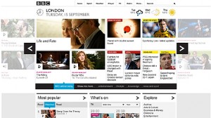
For example, the BBC launched a new version of its homepage that simulates the look and feel of the touch screen user experience. The homepage is in beta, but initial reactions to it are positive. It includes sliding screens that fly across the screen much like apps like Flipboard provide on the iPad and other mobile devices. More importantly for the BBC, it allows more content to be highlighted on the homepage in a friendlier manner that’s easy to navigate. Visitors can personalize the homepage to feature news and information that matters most to them such as local news.
In a BBC press release, it was explained that the new homepage beta will be released in stages:
- Visual release of new carousel format with color coding and icons to represent categories of content.
- Simple filters that visitors can personalize pages based on their interests.
- Sliding drawers that reveal details about popular content across BBC Online and real-time BBC TV and Radio listings.
- At-a-glance views of news, sports, weather, lottery, and travel along with index-based navigation for easy look-up of information.
- A single nations’ homepage that offers local and national information based on a person’s chosen location.
The BBC homepage design is also expected to help the BBC provide greater value for its license-fee payers. As explained in the press release, “by repurposing its products for four screens, the new BBC homepage will be subsequently optimised for mobile and connected TV devices.”
The BBC is thinking ahead and recognizes that traditional website design and content delivery isn’t going to cut it in the near future. Of course, there is much testing to be done and changes will undoubtedly be made, but this represents an important step in companies and brands marrying the mobile opportunity with their online efforts.
What do you think? Have you considered redesigning your website to provide a user experience that simulates the growing popularity of the touch screen? Leave a comment and share your thoughts.
Image: BBC
Susan Gunelius is the author of 10 marketing, social media, branding, copywriting, and technology books, and she is President & CEO of KeySplash Creative, Inc., a marketing communications company. She also owns Women on Business, an award-wining blog for business women. She is a featured columnist for Entrepreneur.com and Forbes.com, and her marketing-related articles have appeared on websites such as MSNBC.com, BusinessWeek.com, TodayShow.com, and more.
She has over 20 years of experience in the marketing field having spent the first decade of her career directing marketing programs for some of the largest companies in the world, including divisions of AT&T and HSBC. Today, her clients include large and small companies around the world and household brands like Citigroup, Cox Communications, Intuit, and more. Susan is frequently interviewed about marketing and branding by television, radio, print, and online media organizations, and she speaks about these topics at events around the world. You can connect with her on Twitter, Facebook, LinkedIn, or Google+.


