There are many theories regarding landing pages within and without the Investor Relations field.
One idea is that a landing page should be quick loading and serve merely as a sign post that the user has arrived at their intended location.
Another theory suggests that as much information as possible should be placed on the landing page in order to provide an interface which requires the fewest clicks from a user in order to reach the information they were looking for. However, this can lead to an unpleasant looking page that is so full of information that it appears unfriendly and perhaps takes longer for the user to find what they are looking for despite any savings in how many clicks it takes to get there.
McAfee Landing Page
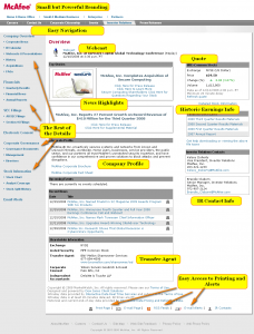
The McAfee investor relations landing page is a solid example of a page which contains lots of information while maintaining its overall readability and aesthetics.
When first viewing the page, one is struck by the fact that although the page remains fully branded, there are remarkably few graphics. This is accomplished by using not only the corporate logo in the upper left corner, but also by using a branded logo as the graphic that accompanies the top news story in the main content area. By using this technique, the page avoids the sparse look that comes from no graphics, while not wasting any area for superfluous design elements.
The other design element which allows for McAfee to get so much information onto this single page is that the separation between sections has not been aggrandized by large overbearing fonts, nor complex scrolls or other design heavy separators. Instead, simple (and proven) gray bars are used with bold text. Thus, the content areas are well separated, again without the cost of space loss.
What remains is a landing page that contains the beginning of virtually all of the basic information any investor might be looking for. Just a quick perusal of the landing page shows just how much information has been loaded at the investor’s fingertips:
- Current Stock Quote
- Most recent webcast
- Most recent earnings information
- A year’s worth of previous earnings info
- Most recent news release
- Company Profile
- Upcoming Events
- List of Press Releases
- Investor Relations Contact Information
- Stock Listing Information
This array of information often takes many investor relations websites several pages to convey to the investor at any level. The success of this arrangement comes from the idea that while a user will appreciate fewer clicks to find the data they are looking for, it is impractical to simply provide multiple full content documents on a single display. Thus, when the McAfee IR landing page displays the “Corporate Profile,” it makes no attempt to display the whole text, nor even a major portion thereof. Instead, a quick overview of what the company does (often referred to in marketing as an “elevator pitch”) is paired with two links. One link goes to the corporate brochure, which no doubt contains a much more complete picture of the company profile, and the other goes to a corporate fact sheet, which contains much of the other information a user might want regarding an overview of the company.
Easy navigation from the landing page to other more specific information is made easy by a clear easy to read menu bar at the left and a compact and user friendly toolbar across the top.
Best Practices – Layout Design for Maximum Information
Contrast the McAfee IR landing page to your company’s investor relations landing page. Are you able to communicate as much information to a prospective or current investor as quickly? Does the graphical design of your landing page use up valuable real estate that could be better spent communicating with your investors? How many clicks does it take to find the same information? For example, a shareholder with physical stock certificates looking for contact information for the IR department, or the transfer agent will require how many clicks to find the same information on your site?
Of course, copying the success of others is rarely the answer, but the layout and design used by McAfee provides a compelling case for the much information on the landing page paradigm without falling victim to its potential flaws. Studying what works here can help lead to ideas that will work for you as well.
 Measuring IR Effectiveness