Continuing my visits to the investor home pages of FTSE 100 companies, I recently visited the Cadbury site. I think my decision to visit the site was subliminal – I’ve been on a diet lately, so perhaps I subconsciously thought that I could satisfy a craving for sweets by visiting their site. I didn’t lick the screen however – you have to draw the line somewhere.
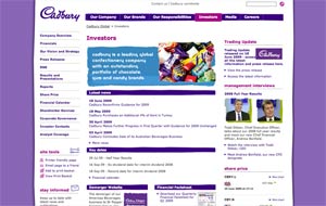
Overall, I thought the Cadbury investor page was quite well done in terms of layout and the information content on the page. The left hand side of the page lays out the major sections within investor relations, enabling investors to find what they are looking for easily. My one quibble with the list of sections is the listing for RNS. Not everyone will know that this stands for Regulatory News Service, but as I say, it’s a quibble.
The center of the page presents important recent information to investors where they are most likely to look for it, while the right hand side of the page focuses on links to longer term information such as a half yearly trading update, management interviews and stock information. The layout and information presentation worked quite well for me.
Alas, I wish I could say as much for the graphic design elements of the page.
The investor page, as it should, carries over the design element of the Cadbury web site, which I find less than attractive and distracting. First, there’s the color – purple. I know that this is a confectionery company and some designer probably chose purple to signify fun and to carry through Cadbury’s signature color scheme, but to me purple printing is just plain ugly. And I say this an alumnus of Northwestern University, which has purple as one of its school colors. Secondly, the graphic elements of the page – uneven lines, ragged edges and lime green color splashes behind the photos, are distracting.
My overall impression on the design side is that Cadbury is trying too hard. Just like candy, a little bit of that stuff goes a long way.


