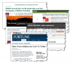
There’s no doubt that Skittles created attention with their extreme makeover! Not only here at Corporate Eye (Media and Brand), but all over the web—discussed and debated by bloggers, social media mavens, and even the relatively staid Wall Street Journal (which provides an interesting analysis).
An interesting part about this: the Skittles site was already more than a little bizarre. (If you don’t recall–or never saw–the “before” version, visit the Wayback Machine. ) So the change may be more noteworthy for its wholesale embrace of postmodern media than merely for novelty per se.
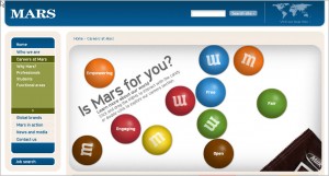
Of course my investigation has to focus on the Careers aspect, which leads to Skittles’ parent company, Mars. And switching to the Mars site is like going back over the Skittles Rainbow to land in Kansas again:
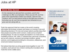
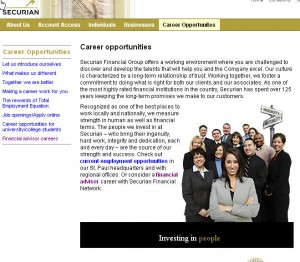
If you are planning a makeover of the Careers site, or even starting from scratch, one of the fundamental design decisions is whether to play it safe or spice it up. A Careers site that looks like 85% of all others runs the risk of boring visitors—or at least, not getting their attention. On the other hand, a site that is radically different from the mainstream is open to one of several visitor interpretations:
- These guys don’t know what they are doing.
- This company looks interesting!
- This site is confusing/awkward/unfriendly.
- I feel right at home here!
And so on. Individuals bring their own assumptions and motivations to the site with them, and (at the risk of over-generalizing) visitors who are looking for security may favor something safe and traditional, whereas visitors looking for a challenge may be attracted to something adventurous and creative. Age may also be a factor—though not necessarily in a predictable way, since older-somethings could be ready for a big change while younger-somethings may be looking for a safe place to get started.
There’s no pleasing everyone, of course, so it’s important to consider the target audience for your industry and your company, as well as the main types of jobs to be listed. And of course, it’s important to maintain a constructive connection to the company’s brand image. But as food for thought, here are three principles that would hold up pretty well across the board:
- A site that looks as if it were made with a Careers-shaped cookie cutter leaves the impression that no one cared very much about the site.
- A site that looks great but doesn’t work well leaves the impression that no one cared very much about the visitor.
- A site that makes the visitor jump through hoops to get information (or to send a resume or apply for a job, etc.) leaves the impression that no one cared very much about recruiting.
(For an example of the middle ground–mainstream done with pizzazz–visit Umpqua Bank.)
