In case you haven’t spent quality time customizing your personal information environment, I highly recommend it. My home page of selected news pays off daily, bringing me several Careers-related RSS feeds and much (much) more. On a recent morning, one “buzz” source offered an item about five radically healthy yet inexpensive foods. I wanted to know what the five foods are . . .
Could I find that out in the five seconds it would take to read five words? No indeed. I had to watch a five-minute video. A perfectly okay video of an ABC News segment, but I didn’t want to spend time watching it. I just wanted the information. (Here’s a gift of three minutes, in case you’re interested: frozen veggies, canned salmon, edamame, sweet potatoes, and brown rice.)
In reviewing Careers sites, I very often experience the same frustration. In some cases, and particularly in employee testimonials and day-in-the-life videos, the medium is necessary for the message. There is no bullet point version, and seeing/hearing the people and events is an important aspect of the information.
In other cases, though, I’d like to get the info without the video—or at least have that choice. And even where the video is key information, I’d like to have something left over from my investment of viewing time. Could I have a text summary after the video? Maybe even a transcript?
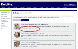
Deloitte does a great job on this!
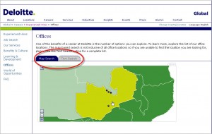
Once again, Deloitte is on track:
 Does Deloitte have everything right? Not quite. And that’s the reason for the post title.
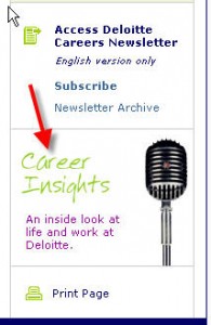
Deloitte hides its nice video/transcript offering under a bushel. It’s not in the left (main) navigation, and not reached from any text links. To get there, you would have to decide to click on a rather vague graphic titled “Career Insights,” which is located at the bottom of a right-hand column.
So as a practical action item . . . consider these suggestions:
- Gizmos should make sense and connect with functionality.
- Videos should be connected with a print message at some point.
- High-value content should be clearly labeled–and placed where the visitor won’t miss it!
