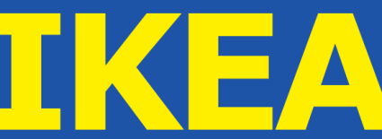
Over the past few weeks, IKEA has been challenged from multiple directions over its new logo — specifically, the font change in its new logo design. Remember the old IKEA logo that used the serif Futura font (check it out below)?

Now take a look at the new IKEA logo with the sans-serif Verdana font (check it out below).

Apparently, this font change has caused an uproar with 3,000 consumers signing a position against the new logo and USA Today and the New York Times writing about it. Is this font change really so bad?
Here are my thoughts: [Read more…] about A Font Causes an Uproar for IKEA
 Sometimes timing truly is everything.
  Landor Associates conducts a
  The
The  Interbrand released its top 100 global brands of 2011 report, and Coca-Cola took the top spot for the 12th year running with the brand valued at $71.9 billion. IBM came in second, and Microsoft rounded out the top three.