I picked a company from the Alternative Investment Market (AIM) at random this morning, and spent 15 minutes (I timed it!) reviewing the site to see what instantly jumped out at me as enhancements I would suggest.
Bearing in mind that I usually spend 2-3 weeks researching and writing a report on a major corporate site, I thought that 15 minutes would be an interesting challenge, and would be enough to come up with a few suggestions that the company might find useful. In 15 minutes, of course, I will necessarily have missed out on a lot, so this shouldn’t be taken to be my final view, or a complete report.
The company I chose this morning was Optimisa.
As always – click on the image to see a bigger version – click again to close.
- The first thing to note is that a Google search on “optimisa” brought up a reference to the company at 7 of the first 10 places, including the top spot, which was the corporate website. I thought this a surprisingly good result.
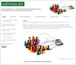
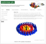
- The design of the site is simple but pleasing – lots of white space and some charming graphics. It seems to be built using WordPress as a content management system, which means that it should be easy for the company to make changes and to update the site on a regular basis.
- I note that there are no references to people, whether employees or clients (other than the board) – presumably all the people and clients are associated with the subsidiary companies. If not, then perhaps there should be some mention of people – employees or clients – whether this is relevant to Careers, CSR, About Us …
Contact page
I suggest that Optimisa should:
- Provide a personalised email address, rather than mail@.
- Give the job title or role of the contact provided. Jonathan Waters is in fact a director and the company secretary, but the contact page (which is the one I went to first) doesn’t tell me that.
- Remove the underline on the name, which implies that this is the link to contact him, though in fact it isn’t a link at all. This is a slight usability issue, which recurs across the site.
- Provide a direct line. The phone number provided looks like a switchboard number. If you are concerned about overloading Jonathan with contacts, either provide a different contact, or set up a filter on his email and calls.
Search facility
- I found this slightly confusing, despite being a very experienced web user. I ran four different searches, and on each occasion received a single result – a press release. It took me a while to notice that there were further results in what had been the navigation bar. I suggest that the results of the search should all appear in the main content section, and allow the visitor to select which one seems the most relevant.
- It also looks as though the search covers only the press releases – when I searched on “board” or “directors”, I still only got a press release, and not the relevant page of the site.
- Again, there are underlined text items that look like links – but aren’t.
- On the Board of Directors page, clicking on the names of the directors brings up more information about that director, as you would expect. However, the information provided is in PDF form. This is mildly annoying as it is slower and less accessible. The information in the PDFs isn’t so extensive that it couldn’t easily be turned into an HTML page. The PDF versions could be moved to the Media section if desired.
- In the History section, the links bring up PDFs of the press releases. Again, I’d rather see HTML pages here. And why not add in a timeline and some text to give some context? I learned from a Google search that Optimisa used to be called bizzbuild – why not include this information in the history section?
- It seems clear that acquisition is a significant part of the company strategy. I suggest providing a Strategy page that explains something of the direction the company sees itself heading in.
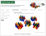
- The detail pages in the group companies section provide a good summary of each of the companies in the group, and links to their websites. The brief text on the landing page ends in a colon, immediately followed by a graphic; because of this, I expected the graphic to be an image map, and clicked on the graphic (an image of five groups of playing-pieces) expecting each group of playing-pieces to take me to one of the subsidiary companies. Perhaps that’s just me … but why not provide links to the subsidiary companies in the main content section, not discreetly in the navigation? And please remove that colon, if it isn’t going to be followed by any content …
- I’d like to see more information about the synergies between the companies. Why are these four companies a group? What are the similarities and differences between them? Are the directors of Optimisa involved in the subsidiary companies? Perhaps an organisation chart would help here, showing the relationship between the companies and perhaps giving the names of the senior management of each of the subsidiaries.
- Again, when Optimisa discuss the industries in which they work, I’d like to see a graphic illustrating the expertise of each company in each area, rather than a long list of industries. In fact, I’d like to see more graphics to help the text throughout the site.
Media Centre
- This was a rather grand title for what turned out to be a list of links to press releases. I’m sure this section could be enhanced with images of the Board, an Optimisa-at-a-glance page, a Media contact, and – finances permitting – some multimedia content.
- I noticed, too, that there seems to be no RSS feed – this would be very easy to implement, if the site is, as I think, built on WordPress. And – this is obviously one of my hot buttons today – the press releases are all PDFs rather than HTML.
Investors
- This is where I ran out of time under my self-imposed 15 minute deadline. However, I did have time to notice that there is no stock quote or charts, and that the annual reports are all PDF rather than the increasingly-popular online versions.
Summary
I think there are several ideas here that could help Optimisa enhance their website, though there are many areas and ideas that I haven’t touched on – and couldn’t, in only 15 minutes.
The impression that this website leaves me with is one of a rather small company. This is always tricky for a company which is essentially a group of companies, but if Optimisa want to promote themselves, I think they should develop their site so that they come across as a bigger, more powerful company than, perhaps, they really are.
I shall be doing more of these 15 minute reviews – I’ve enjoyed it. If you’d like to be included, or if you’d like me to conduct a detailed benchmark review, please feel free to contact me.
Lucy is Editor at Corporate Eye


Excellent review, Lucy. It’s amazing what a fresh set of eyes and some intelligent, focused thought can generate. I hope Optimisa takes these suggestions seriously!
Hi Easton – thanks for visiting, and for taking the time to comment.