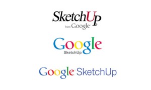
 In 2000, a 3D modeling tool debuted called SketchUp, which was purchased by Google in 2006. Since then, SketchUp became part of the Google brand architecture, which meant the SketchUp identity was Google-ified. As Aidan Chopra explained on the SketchUp blog, “The Google years brought several logos as we responded to successive top-down branding directives. None were particularly inspired.”
You can see the evolution of the SketchUp logo as part of Google in the image to the left. The first logo is simply the original SketchUp logo with the Google name tacked on, and the logos on the bottom are later evolutions of the brand logo.
But the Google days are over for SketchUp, which was sold to Trimble in April 2012, and that means it was also time for a new brand identity. Rebranding SketchUp meant the brand could return to some of its core messages of simplicity, perspective, dynamism, friendliness, and professionalism rather than “stodginess or head-banging complexity,” as Aidan Chopra explained.
The new SketchUp logo is shown below. The new logo icon looks like a cube, which seems appropriate for a 3D modeling tool, but as Chopra points out, “It isn’t really a cube at all. The implied stairs or levels are an apt representation of our roots in architecture and other construction disciplines.” Furthermore, the chevrons in the logo icon create a series of hidden arrows pointing upwards — a nod to the “Up” part of SketchUp.

Ultimately, the SketchUp logo needed to be flexible to work in diverse media, as a screen icon, and more. Any brand that’s moving out from under a massive brand umbrella like Google has an opportunity to truly stand out with a phenomenal rebranding initiative. While marketers and customers might argue that the SketchUp logo isn’t perfect, the new identity is a significant departure from its Google identity. And returning to a red color palette that points to the history of the SketchUp brand before Google owned it, is a wise decision — not to mention the fact that SketchUp finally has a desktop icon!
What do you think of the SketchUp rebranding? Leave a comment and share your thoughts about branding after parting from a well-known brand like Google.
Susan Gunelius is the author of 10 marketing, social media, branding, copywriting, and technology books, and she is President & CEO of KeySplash Creative, Inc., a marketing communications company. She also owns Women on Business, an award-wining blog for business women. She is a featured columnist for Entrepreneur.com and Forbes.com, and her marketing-related articles have appeared on websites such as MSNBC.com, BusinessWeek.com, TodayShow.com, and more.
She has over 20 years of experience in the marketing field having spent the first decade of her career directing marketing programs for some of the largest companies in the world, including divisions of AT&T and HSBC. Today, her clients include large and small companies around the world and household brands like Citigroup, Cox Communications, Intuit, and more. Susan is frequently interviewed about marketing and branding by television, radio, print, and online media organizations, and she speaks about these topics at events around the world. You can connect with her on Twitter, Facebook, LinkedIn, or Google+.


I’m just curious. Is rebranding always associated with the logo of a product? Or does it somehow represent the changes that will follow on after rebranding the logo? Does it signify something, or changing the logo just say that they are keeping up with the modern world?