When was the last time you checked your sitemap?
I ask because recently I’ve seen a few sitemaps with one of these problems…
1. Sitemap contains broken links
A good 404 page can help recover in this case, but there are tools to check for broken links.
2. Site map contains duplicate references
- majorcorporate.com/about/location-one/map.html
- majorcorporate.com/about/location-two/map.html
These two lead to different pages. Fine, but if what is visible on the page is
map
map
then this becomes less helpful for the human visitor – though with a bit of thought they’d work it out – even though it may work for the visiting search engine spider. This could be designed out, either by specifying different filenames (location-two-map.html, for example) or by using indentation to indicate ‘ownership’ of the map links.
3. Sitemap contains meaningless references
- Page 1
- Page 2
- Page 3
- Page 4
- Page 5
(I’ve changed the numbers!) As you can see, not very helpful to the human visitor, though search engines will have spidered the pages satisfactorily, as all the links were working. A thorough review at the sub-edit stage would have picked this up.
4. Sitemap contains links to dummy page
This is probably as a result of a typo in the site map, or possibly a slipup in version control in development. This is more difficult to spot without manually checking every single link, as the link goes to a functioning page. And manually checking every single link on a sitemap for a big corporate site is a horrible job.
5. Sitemap is incomplete
Either way, there are people who use the sitemap to find content, so including most of the content on your sitemap is helpful. I’m not going to suggest including all of it: a link to Press Releases 2009 is probably better than individual links to each of the press releases in that year. And if you have good search and filter options in your Media section, then you could probably get away with a single link to Press Releases. Sitemaps and search aren’t interchangeable.
According to Nielsen, back in 2008, 7% of people used a site map to find content. Though this number had declined since his last check, I’m sure it’s not just me that visits these pages.
Good practice for site maps
- Have one. Not all companies do.
- Link to it from every page. Some sites make it available only from the Site Services pages.
- Make it legible. A long list is difficult to read. Consider using design elements to make it easier, such as indentation (see Marks and Spencer) and bullet markers. Some companies colour code different sections; others put them in separate blocks (for example, see Novartis or BASF, right).
- Hundreds of pages? You could consider having different site maps for the different sections of your corporate website, but do make it clear on each one that there are other site maps – and link to them.
BASF have a separate sitemap in their investor section (which is a subdomain of the main site).
Site map or site index?
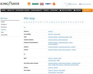
I’ve noticed that some companies now maintain a site index, alphabetically (so: analyst estimates, analyst recommendations, auditors, awards…) rather than a map.
Kingfisher do this (though they still call it a map), as do Centrica. These two both indicate the breadcrumb trail as the link (example: About Us – The Kingfisher story – Vision), to show where the page sits in the site. Though this isn’t a functioning trail – you can’t get straight to The Kingfisher story – it does show how the pages fit together.
Interestingly, Kingfisher provide two trails to some of their pages on the site map. Business Principles, for example can be reached by
About us – Business Principles, or Responsibility – Our approach – Principles and policies – Business principles.
Integral sitemap or dedicated sitemap page?
There are lots of different ways of presenting your sitemap, including on a dedicated page (example: Standard Chartered), listing the links in the footer (as Shell do), a dropdown from the footer site services bar (see Logica for an example) or possibly via a megamenu containing all links.
I recently saw this one on the Cephalon site, which struck me as rather unusual: it’s a pull down site map, clearly highlighted in the top site services bar.
Clicking on the link pushes down the whole body of the page to drag down the sitemap from ‘above’ the window, rather than pulling down the sitemap over the top of the page. I did do a cross-browser check, and it works like this in at least the 3 browsers I checked, so it is intentional.
I like it, though clearly if you had hundreds of pages to link to it might not work so well.
More to sitemaps than you thought?
Want to read more about sitemaps? Elated have a helpful discussion of sitemaps with plenty of examples, and Rob Mills (whose ‘safety net’ description I picked up) provides more examples over at Think Vitamin.
What would you add? What else should someone designing a sitemap think about?
Lucy is Editor at Corporate Eye


