 Thinking of using a leaf in your brand’s new logo design? You might want to think twice about that decision, because it’s not unique. That’s according to data from the U.S. Patent and Trademark Office as analyzed in James I. Bowie’s new blog, Emblemetric, which uses quantitative analysis from USPTO data to decipher and report logo design trends.
Nearly 3.8% of logos use a leaf in their designs (that includes generic leaves only, not specific types of leaves such as maple leaves or elm leaves). The trend of using leaves in logo design picked up steam in 2000, and today, leaves are considered a visual shorthand of an eco-friendly brand message. However, the use of leaves in logo design is even more popular in specific industries such as agriculture, chemicals, pharmaceuticals, and beverages (approximately 10%-13% of logos in these industries use leaves in their logos). Even the advertising industry is above average in its use of leaves in their own logos (approximately 4%).
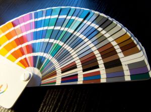
Bowie also researched the use of color in logo design. He found that most logos include the colors blue, red, or green. Red took the top spot in the beverages and hospitality industries while blue is most popular in the chemicals, insurance, medical, and pharmaceutical industries.
More interested in the geography of logo trademarks? Bowie has analyzed that, too. He wanted to learn if logos differ based on the location of the companies and organizations they represent, and his research found the following geographic breakdown of U.S. logo trademark share:
- West = 23.5%
- East = 21.6%
- South = 20.3%
- Non-U.S. = 18.1%
- Midwest = 16.5%
Bowie found that logos in the west are far more likely to use basketballs than any other region while logos in the east are more likely to use marijuana plants and surfboards. In the south, logos are more likely to include tobacco leaves, and logos in the midwest are more likely to include corn stalks. Foreign logos are more likely to include alcohol bottle labels than in any U.S. region. You can get all the details about these logo color trends by region here.
So far, Bowie’s blog is interesting and entertaining. I’m patiently waiting for the swoosh and circle analyses – two of the most overused elements in logo design, in my opinion. What trend in logo design is most intriguing to you? Leave a comment and share your opinion.
Image: Joanna Kopik
Susan Gunelius is the author of 10 marketing, social media, branding, copywriting, and technology books, and she is President & CEO of KeySplash Creative, Inc., a marketing communications company. She also owns Women on Business, an award-wining blog for business women. She is a featured columnist for Entrepreneur.com and Forbes.com, and her marketing-related articles have appeared on websites such as MSNBC.com, BusinessWeek.com, TodayShow.com, and more.
She has over 20 years of experience in the marketing field having spent the first decade of her career directing marketing programs for some of the largest companies in the world, including divisions of AT&T and HSBC. Today, her clients include large and small companies around the world and household brands like Citigroup, Cox Communications, Intuit, and more. Susan is frequently interviewed about marketing and branding by television, radio, print, and online media organizations, and she speaks about these topics at events around the world. You can connect with her on Twitter, Facebook, LinkedIn, or Google+.


