 There are some business sectors for whom sustainability is a hot issue, and with oil spilling all over the Gulf of Mexico and Shell recently admitting it hadn’t done enough in the Niger Delta, oil producers are definitely among those with the greatest CSR problems in the world.
So perhaps it’s not surprising then to find that they have some of the most progressive CSR websites around.
One of the facets which leads to this conclusion is the sites’ interactive data provision. This was pioneered a few years ago by Shell but, in a fine example of site content competitiveness, BP has also introduced its own set of interactive data tools as have several others.
However, if this innovation is left to one side, how else do the websites perform? In a slight change to previous FTSE 100 Website Reviews, this one looks not just at two big hitters within the UK, BP and Shell, but also one from continental Europe, Total, and one from the USA, Exxon Mobil.
Interestingly, these are also respectively the fourth, first, sixth and second largest companies in the world, according to Forbes. Will their websites reflect this?
BP
BP at present is all over the news because of the Deepwater Horizon disaster in the Gulf of Mexico and it’s interesting to note that other oil companies have not been shy in issuing press releases about what they think BP should be doing to “plug the leak”.
It’s unsurprising therefore to find that the BP site has a special “Gulf of Mexico response” section on its top level menu bar. I have long bemoaned the fact companies rarely react to bad news on their websites, simply because it’s a perfect stakeholder engagement opportunity which should not be missed.
BP make the case for such bad news sections admirably, with daily updates, technical briefings, regional responses and all sorts of maps and data. Admittedly there are few bad news stories worse than Deepwater Horizon, but then not every one needs such comprehensive coverage. Just ignoring the issue, however, tends to alienate stakeholders, not engage them.
The company’s more traditional CSR section, headlined “Environment and society”, covers a wide variety of issues from traditional Environment management to Alternative energy and the “BP Energy Lab”. This latter includes an energy consumption calculator, a fun energy quiz and the ability to share an energy fact with other website users.
The site, in BP’s green and yellow livery, is surprising on the eye rather than shocking, but with every page throwing up context sensitive links in the right hand column there’s more than enough to keep you interested in discovering more.
Shell
Shell is one of the few websites these days which does not have a main menu banner across the top of its pages. Instead it has a more traditional breadcrumb trail and uses solely the headings in the left hand column to provide visitor navigation.
This can give the impression there is less content on the “Environment and society” site than there really is as, quite sensibly, the left hand menus contract as you move from section to section. However the full set of section headings is presented in the page footers and visitors may navigate from there.
Interestingly, Shell maintains dedicated country-based independent websites (presumably based upon its operational locations). Each of these conforms precisely to the Shell corporate layout but each has its own “Environment and society” content focusing upon the specific issues which that country faces.
The content isn’t allowed too far off the leash and most of the subsections refer the reader to the global site, for further information, and the company’s overall sustainability report. However, this is a nice nod in the direction of acknowledging that different communities need very different engagement from a corporate multinational.
Like BP, Shell follows its corporate livery and has designed the site around the red and yellow of its logo. However this is barely noticeable and the majority of pages are a simple and unobtrusive affair of black text on a white background with a splash of colour at the top.
Total
Unlike BP and Shell, Total’s website is not based around its logo colours. Instead it uses a big bold frame to surround its content whose colour is determined by the section being viewed: for example orange for “About Us”, blue for “Investors” and green for “Environment and society”.
The sections the company uses approach the material from a slightly different angle to most. with two of the sections titled “contributing to host country development” and “operating in challenging environments”. There’s even a section on socially responsible investment within the investors section.
Probably the most interesting part of their website though is the innocuously named “Expert infos” section. This contains some brief Q&A sessions held with some French luminaries, such as the co-winner of the 2008 Nobel Prize in Physiology or Medicine and the European Chair of Sustainable Development – Environment, Energy and Society at Collège de France.
A fair few of these are involved in Total operations in one way or another, so a small bit of salt needs to be taken with the information. However by no means all of the detail is aimed at puffing up Total and it is refreshing to see information provided for information’s sake. Very French, given the country’s tradition of philosophical discourse.
It is this slightly different approach to sustainability which draws you into the Total website, alongside the accessibility innovation of having most if not all of the website pages available in audio form as well.
ExxonMobil
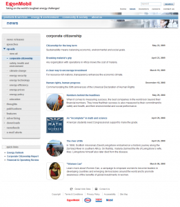
Exxon Mobil’s website is interesting for a number of reasons. The first is that it has one of the most comprehensive corporate News sections on the web. Press releases are not limited just to Investor Relations matters but cover all aspects of the company’s operations, ranging in May from the appointment of directors to the preparedness of Red Cross volunteers ahead of hurricane season in the Gulf of Mexico.
However these are just the tip of the iceberg. The section also includes “thoughts”, “publications” and “features”. Although these are not categorised, because energy and oil is very much under the sustainability spotlight practically all are relevant in one way or another.
In addition, the company’s “op-ed” section is categorised. This holds an archive of all the opinion pieces the company has had published in a variety of journals and newspapers, such as the New York Times.
It is this thoroughness which pervades the rest of the company’s CSR offering, which eschews the European categorisation and is split between “energy and environment” and “community and society” sections. Each neatly and succinctly keeps the section’s main headings and quick links in the left hand column with sitewide widgets in the right hand one and main content in the centre.
In total, a well presented site whose blue-grey design and mix of words and white space makes it easy to spend time on and investigate further.
Conclusion
It’s difficult to pick one site over another simply because different points of emphasis creates such a variety it would be manifestly unfair to say one way better than the other.
However, the oil extraction and refinement business has long been under the sustainability spotlight and if other companies wish to find out how to write the perfect sustainability website they could do a lot worse then scrutinise these.
Picture Credit: Classic Oil Rig by epredator from flickr under Creative Commons Attribution License, trimmed by Chris Milton.
A former CTO, Chris has a broad and varied background. He’s been involved with blue chips, consultancies & SMEs across a wide variety of sectors and has worked in Europe, the Middle East and Australia.
In 2007 he decided to combine his knowledge of business and IT with his passion for all things sustainable and has been busy writing ever since. However, his greatest ambition remains to brew the perfect cup of coffee.


