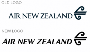
 Air New Zealand launched its new logo recently, but consumers aren’t happy (read the comments on the announcement article). The new logo features a new color palette — black and white, and consumers want the old blue and green color palette that reminded them of the ocean to come back.
Kris Sowersby, the typeface designer who created the lettering for the new Air New Zealand Logo, posted details about the creative process behind the logo on his blog (it’s a great read). In his article, he wrote that according to the client’s request, the new logo was to be “a wordmark that reflects an innovative, modern company but projects our history, credibility and with a timeless elegance.”
Sowersby worked with design agency Designworks to develop the new logo for Air New Zealand. You can see it above. It’s surprisingly similar to the old logo, but the new type is an improvement.
Air New Zealand CEO Rob Fyfe explained the new logo in his announcement of its launch. He said, “Our iconic symbol, the Koru, will remain but it will be set within our national colour rather than the blue and green tones on our tails today. Alongside this change we are introducing a new lettering style for the Air New Zealand name, which will adorn all our new aircraft. This will also be rolled out across all our signage and communications channels by the end of the year.”
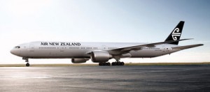
Of course, consumers are usually not happy with any kind of change to the brands, products, and services they like and are familiar with. However, the change to the Air New Zealand logo is so minimal that had the announcement not been made, most consumers might not have noticed. The bigger concern among consumers is the loss of the blue and green colors on the Air New Zealand planes (check out the before and after images below).
 New Logo
Old Logo
Undoubtedly, in time, consumers will navigate through this brand evolution, and their negative feelings about the change will fade. At the end of the day, as long as the service doesn’t change and the brand continues to meet their expectations, the colors on the plane are unlikely to have a big impact on the brand’s success.
Remember, logos, typefaces, and colors are just tangible elements of a brand. It’s the brand promise and consumer perceptions and expectations of the brand that make or break a brand.
Susan Gunelius is the author of 10 marketing, social media, branding, copywriting, and technology books, and she is President & CEO of KeySplash Creative, Inc., a marketing communications company. She also owns Women on Business, an award-wining blog for business women. She is a featured columnist for Entrepreneur.com and Forbes.com, and her marketing-related articles have appeared on websites such as MSNBC.com, BusinessWeek.com, TodayShow.com, and more.
She has over 20 years of experience in the marketing field having spent the first decade of her career directing marketing programs for some of the largest companies in the world, including divisions of AT&T and HSBC. Today, her clients include large and small companies around the world and household brands like Citigroup, Cox Communications, Intuit, and more. Susan is frequently interviewed about marketing and branding by television, radio, print, and online media organizations, and she speaks about these topics at events around the world. You can connect with her on Twitter, Facebook, LinkedIn, or Google+.


More like spot the difference :)