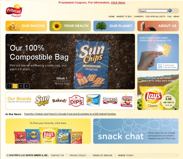
A recent article on BrandWeek brought to my attention the redesign of the FritoLay website. FritoLay, a division of PepsiCo, is known for its snack foods, including popular items like Lays Potato Chips, Doritos, Tostitos, and more. You’d expect to find a fun website for a snack food company, and the redesigned FritoLay website certainly feels less corporate and more “homey” as you can see from the home page pictured below.

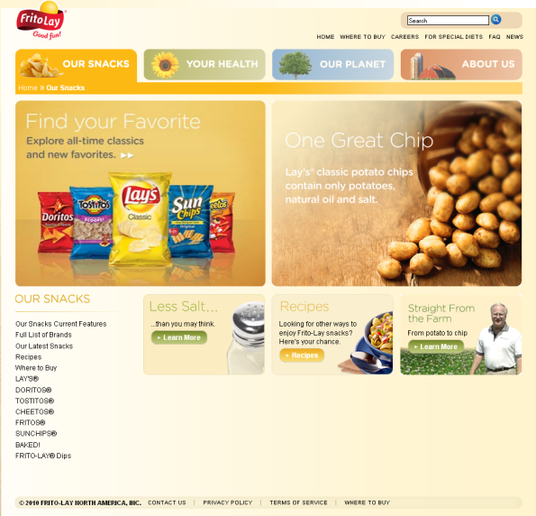
Rather than using the expected top navigation bar, the new FritoLay site uses colorful buttons and a soft color palette. The predominant links on many pages within the site highlight the same content about health, the environment, and the company’s socially conscious efforts, as you can see from the “Our Snacks” page pictured below.

I think the site is an improvement, but I think it could use a stronger focus on consumer interaction rather than speaking at consumers and telling the story. The link to the company’s blog is buried and there are no evident links to ongoing conversations, Facebook pages, Twitter profiles, and so on (until you find the blog). These days, this is a big miss that I hope FritoLay will rectify in updates in the near future.
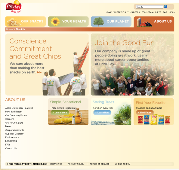
Furthermore, there is no information about the brand promises, logo use, and so forth. The company vision is accessible through the “About Us” page shown below, but a vision is very different from a brand promise, and for a company that has multiple, well-known and powerful brands, the website should include a section about branding, the history of the brand (rather than just the company history), logos and packaging through the years, and so on. In other words, the brand stories are important for FritoLay, and they should be given the space they deserve.
All-in-all, FritoLay is on the right track. The streamlined site that uses little flash is a welcome change in a time when most websites are still flooded with flash that does nothing to enhance the user experience. The new design is less cluttered than many corporate sites, which is another positive outcome of the redesign.
What do you think of the new FritoLay website design? Leave a comment and share your thoughts.
Susan Gunelius is the author of 10 marketing, social media, branding, copywriting, and technology books, and she is President & CEO of KeySplash Creative, Inc., a marketing communications company. She also owns Women on Business, an award-wining blog for business women. She is a featured columnist for Entrepreneur.com and Forbes.com, and her marketing-related articles have appeared on websites such as MSNBC.com, BusinessWeek.com, TodayShow.com, and more.
She has over 20 years of experience in the marketing field having spent the first decade of her career directing marketing programs for some of the largest companies in the world, including divisions of AT&T and HSBC. Today, her clients include large and small companies around the world and household brands like Citigroup, Cox Communications, Intuit, and more. Susan is frequently interviewed about marketing and branding by television, radio, print, and online media organizations, and she speaks about these topics at events around the world. You can connect with her on Twitter, Facebook, LinkedIn, or Google+.


” The streamlined site that uses little flash is a welcome change in a time when most websites are still flooded with flash that does nothing to enhance the user experience. The new design is less cluttered than many corporate sites, which is another positive outcome of the redesign.”
You can see more?