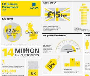
 Aviva list infographics for inclusion in their pick-and-mix download pack.
For the most part, companies provide documents only; it is rare to see images included, and so to see infographics is very striking.
Most of the infographics contain summaries of their research reports, but there is one that is a summary of their business performance in 2011 (screenshot above).
Infographics are commonly used as part of a link building program, so can have a poor reputation, but if the information is valuable and/or interesting, and if the infographic is well designed, then the infographic will be shared. And if the company name is embedded in the infographic, then naturally the company name will go the rounds as well.
We like this because it is unusual, and because the infographics are well done, but mostly because bloggers/journalists are likely to pick them up and reuse – all potentially good publicity for Aviva.
Lucy is Editor at Corporate Eye


