Back in February 2009, I wrote an article for Corporate Eye about a new logo launched for the well-known Kraft brand. In an effort to “more clearly deliver delicious,” the brand’s racetrack logo was replaced with what was supposed to be a friendly and colorful burst with a smile. Later that same year, Kraft revamped the friendly logo and moved the burst to the other side of the Kraft name. Fast forward three years to 2012 and Kraft is going back to its roots with a new logo that looks extremely similar to the old racetrack logo.
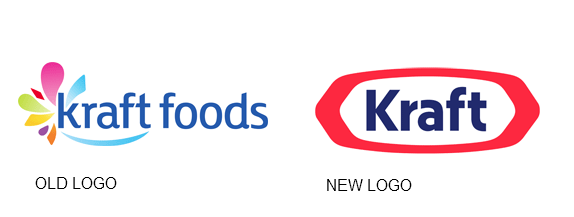
Late 2009 Logo vs. New 2012 Logo
First, check out the version of the Kraft logo used since late 2009 (on the left) compared to the new 2012 Kraft logo (on the right).

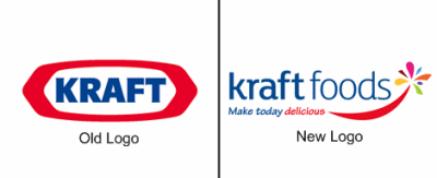
Pre-2009 Logo vs. February 2009 Logo
Now, compare the pre-2009 Kraft logo (on the left) to the version launched in February 2009 and used until the latter part of 2009 (on the right).

Notice how similar the new 2012 logo is to the pre-2009 logo?
The 2012 logo is meant to rebrand Kraft as an independent company after it was spun off into Kraft Foods Group in late 2011. In the press release that accompanied the new logo launch, Kraft Foods Group CEO Tony Vernon provided a quote that offers some insight into the rebranding effort:
“Today is the beginning of a great new company, a totally new Kraft, one with the spirit of a startup and the soul of a powerhouse,” said Vernon. “We are proud of our rich history and deeply passionate about Kraft’s future. We see this as an opportunity to build something extraordinary, to create a renaissance in the North American food & beverage industry.”
The 2012 Kraft Foods Group logo is a welcome change from the “trying to hard to be friendly” version introduced in 2009. It’s the perfect time for the brand to return to its heritage and leverage the equity of the previous logo. Giving it a modest facelift to modernize it works well. The 2009 logo will become a blip in Kraft’s history that calls attention to a time of confusion for the brand. Hopefully, Kraft Foods Group can return to the brand consistency that enabled it to build value while positioning the brand to stay relevant in the future.
What do you think about the “new” Kraft logo? Leave a comment and share your thoughts on rebranding by returning to the past.
Lucy is Editor at Corporate Eye


