The Apple logo has become an iconic symbol of one of the strongest relationship brands, but it wasn’t always the cool monochromatic, Web 2.0 logo that it is today. In fact, the Apple logo has undergone three major redesigns since the original was created in 1976.
1976
 The original Apple logo was created by one of the lesser-known founders of Apple Computer Co., Ronald Wayne. It’s hard to even notice the apple hanging from the tree above Sir Isaac Newton’s head in this image. The text that borders the image (which is too small to read at any size) reads, “Newton… A Mind Forever Voyaging Through Strange Seas of Thought … Alone.” It’s not surprising that this logo only lasted a year as the primary tangible symbol of the Apple brand. There is really nothing positive that you can say about it in terms of branding a technology company.
1977
 The rainbow apple is the logo that most consumers saw in their introduction to the Apple brand. Apple brand champion Steve Jobs, himself, hired graphic designer Rob Janoff of the Regis McKenna Advertising Agency to design the new logo, and the final design chosen — the rainbow apple — worked. According to some reports, Janoff has claimed the bite taken out of the apple was intended to show people that the image was an apple, not a tomato, and it was a play on words between “bite” and the technical term “byte”.
1998
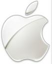
 One year after Steve Jobs returned to the helm of Apple (after he was ousted from the company years earlier), he called for a logo update, and what came out of this redesign was a color change from the dated rainbow palette to a modern monochromatic version that was also highly web-friendly. The primary color for this Apple logo, which is still used today, is chrome, but it has appeared in other colors as well. In a word, the new logo was sleek and matched the new direction Jobs planned to take the company. The monochrome Apple logo has even been reported as stimulating the brain and making people who are exposed to it more creative (according to a 2008 study by Duke University). The logo redesign in 1998 was subtle, but very effective in repositioning the brand and moving it into a new century in consumers’ minds.
Companies spend millions of dollars on rebranding initiatives, often dropping millions on a logo redesign alone. While I’m sure Apple invested quite a bit in its two logo redesign efforts, the lesson to learn from this history report is this — if there is value in your logo as a tangible symbol of your brand, a complete logo redesign might not be the best strategy to revamp or rebrand. Subtle changes could make a better difference and yield better results. However, sometimes a complete redesign is warranted, as in the case of the original Apple logo, so don’t be afraid to admit when your tangible brand elements just aren’t working.
What do you think?
Susan Gunelius is the author of 10 marketing, social media, branding, copywriting, and technology books, and she is President & CEO of KeySplash Creative, Inc., a marketing communications company. She also owns Women on Business, an award-wining blog for business women. She is a featured columnist for Entrepreneur.com and Forbes.com, and her marketing-related articles have appeared on websites such as MSNBC.com, BusinessWeek.com, TodayShow.com, and more.
She has over 20 years of experience in the marketing field having spent the first decade of her career directing marketing programs for some of the largest companies in the world, including divisions of AT&T and HSBC. Today, her clients include large and small companies around the world and household brands like Citigroup, Cox Communications, Intuit, and more. Susan is frequently interviewed about marketing and branding by television, radio, print, and online media organizations, and she speaks about these topics at events around the world. You can connect with her on Twitter, Facebook, LinkedIn, or Google+.


Hello, I found this article very interesting, but I still wonder about one thing. I recently heard a story about, what some consider the father of modern computers, Alan Turing. He did make some very significant contributions to science and technology that have made modern day computers possible. The relation to your article is his significance to computers, his personal life style, and how ultimately he died. Listening to the story, which can be found here, http://www.youtube.com/watch?v=DF2K80SJ9Ag&feature=related , I am wondering if the selection of Apple’s second logo had anything to do with Turing. He made major advancements in computing, he died from a poison apple, and he was homosexual in a time when it was very much misunderstood. To me it seems the Apple with the rainbow is a sort of dedication to the amazing minds of the past, the revolution of thinking outside the box, and to just be different.
My question to you is; is this just coincidence or was the colored apple meant to intentionally memorialize the father of computers, Alan Turing?