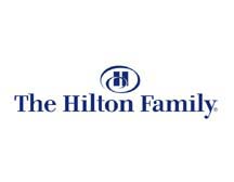
Hilton Worldwide owns a lot of brands — Hilton Hotels, DoubleTree, Embassy Suites, Waldorf Astoria, and more. Those various brands appeal to a wide array of demographics and represent very different images and messages. Until recently, all of those brands operated under the fairly boring Hilton Family logo shown below:

Apparently, Hilton Worldwide thought it was time for a logo upgrade, but instead of creating a new, modern logo to represent the parent company, they chose a logo that simply knocked the Hilton Hotel logo on its side, changed the colors and font, and added a bevel.
Here’s the Hilton Hotel logo on the Las Vegas Hilton:

And here’s the new Hilton Worldwide logo:

Designers are sounding off on this logo saying the bevel effect does exactly the opposite to modernizing the logo. Rather than looking Web 2.0, the logo looks circa 1990. Additionally, designers are claiming the icon is offset to far to the left of the text, so they look like two separate units. Many designers also believe the weight of the font used for ‘Hilton’ is too light, and the loose kerning makes the core brand name lose importance and clarity.
I have to agree with those thoughts and add that the new logo looks very, very corporate — practically bank-like in its political correctness. It seems that the desired reputation of the Hilton brand tries to run in inverse proportion to the Paris Hilton brand in that the more flamboyant, outrageous, and in your face Paris gets, the more conservative Hilton gets. (I’m joking, of course — sort of).
I can’t imagine what Hilton’s goal was for this new logo investment. An opportunity was lost. The gold and silver color choices will undoubtedly translate nicely when printed in metallic ink and convey an upscale, luxury image, but how often is that really going to happen?
Let’s hope this isn’t a new trend. We certainly don’t need more brands hopping on the 90-degree rotated and beveled logo brand wagon. The last thing the branding world needs is a 90-degree rotated and beveled Nike logo. Let the Hilton logo be the last.
Photo source: Flickr
Susan Gunelius is the author of 10 marketing, social media, branding, copywriting, and technology books, and she is President & CEO of KeySplash Creative, Inc., a marketing communications company. She also owns Women on Business, an award-wining blog for business women. She is a featured columnist for Entrepreneur.com and Forbes.com, and her marketing-related articles have appeared on websites such as MSNBC.com, BusinessWeek.com, TodayShow.com, and more.
She has over 20 years of experience in the marketing field having spent the first decade of her career directing marketing programs for some of the largest companies in the world, including divisions of AT&T and HSBC. Today, her clients include large and small companies around the world and household brands like Citigroup, Cox Communications, Intuit, and more. Susan is frequently interviewed about marketing and branding by television, radio, print, and online media organizations, and she speaks about these topics at events around the world. You can connect with her on Twitter, Facebook, LinkedIn, or Google+.


