Have you noticed Google’s “instant preview” feature?
If you run a Google search for your company, you should see at least one result; ideally, you’ll see several pages from your site. Each will have a small magnifying glass to the right hand side… if you click that, you’ll see a thumbnail snapshot of the page.
Does your site look attractive at this scale? Is the page complete? Does your logo stand out? Is your branding recognisable?
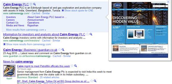
These previews aren’t always flattering to the corporate site. Zipping through some of the FTSE 100 companies, I did spot some issues:
- some sites are displaying with blank sections, where, presumably, part of the page hasn’t loaded before the snapshot was taken
- I also saw one with a ‘down for maintenance’ display; I expect that this will be overwritten the next time the site is spidered
- sites with a Flash-based home page (or elements on the page) don’t display well, showing just the plugin-jigsaw-piece image where the Flash should be.
Search Engine People found that sites with popups, where the page dims to highlight the popup, look bad, though this isn’t usually something that corporates use; something to bear in mind if you’re adding in a site survey popup, perhaps. Do go and read the Search Engine People post if you haven’t seen it yet, as there’s a lot of good examples and discussion there.
The good news is, though, that some sites look great at this scale, clear and attractive, with strong branding messages. The Cairn Energy preview shown above, for example, looks bright and vibrant, helped perhaps by the home page being short and wide rather than long and thin.
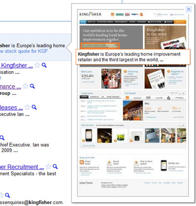
And some sites have text highlighted – see the screenshot for the Kingfisher home page, where the highlighted text happens to be a positioning statement. The company should be pleased with that!
If your site has words displayed, are they useful to the visitor and helpful to you? This snippet is generated based on what the searcher is looking for, and the text on the page, so may be little that can be done to improve this other than ensuring that all content on the page is carefully honed. We can see that this varies, because if, for instance, I search for Aviva Group, and then for Aviva plc, and look at their About page, different text is highlighted in each case.
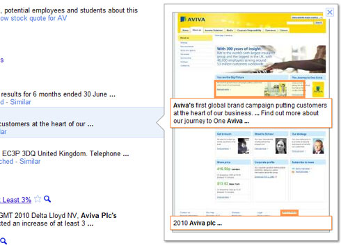
Searching for Aviva PLC..
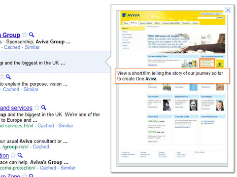
…and for Aviva Group.
This may not be something that you need to worry about. I expect that the images will get updated regularly, so if your site had a bad hair day, it may not be visible for long. I imagine that not many people will use this feature when looking for a corporate site; after all, if you know which company you’re looking for, you’re probably not going to be tempted into visiting a different organisation. However, if people are likely to search for your products and services, this may matter a great deal.
It is possible that people will use this feature when looking for information usually found on a lower level page, to cut out navigation within the corporate site. The extent to which people will use it is, as yet, unknown, but it will be interesting.
What do you think: will this matter? Is it a feature you’re likely to use much yourself when searching?
Lucy is Editor at Corporate Eye
