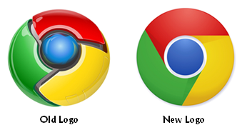
Over the past decade, more and more companies have been investing in logo redesigns in order to create logos that seems more modern and digital. The glossy, 3-dimensional redesigns have been called the Web 2.0 logo redesign trend. However, that trend might be coming to an end if a new design for Google’s Chrome brand is a sign of things to come.

The Brand New reports that the new logo was first sighted on Google’s Chromium site earlier this year. It’s expected that the logo will eventually make it’s way to other Chrome-branded sites, services, and products.
The highly-stylized Web 2.0 Chrome logo debuted when Google’s web browser was launched in 2008. Two sides of the new Chrome logo debate are forming. One side likes the change to the simply style and matte colors, while the other thinks the new logo is a step backwards.
I have to admit that I’m on the side of this debate that prefers the new, simpler design, and it performs slightly better in a one-color test. I’ve never been a fan of the Web 2.0 logo redesign trend, so my curiosity was piqued when I heard about this new Chrome logo. However, it still includes shading and color use that implies the 3-D, Web 2.0 trend. In other words, Google couldn’t completely get away from the Web 2.0 logo design trend in this new attempt.
It will be interesting to see if Google goes through with rolling out this new logo. And if Google does replace its Web 2.0 Chrome logo design with a simpler version, will it be the first in a new logo design trend? Will other brands ditch the Web 2.0 glitz, too?
Only time will tell. What do you think of the Web 2.0, 3-dimensional logo design trend? Love it? Hate it? Has it run its course? Leave a comment and share your thoughts.
Lucy is Editor at Corporate Eye


