Despite the importance of the media (both traditional and new) to a corporate brand, some companies don’t seem to cater to the needs of this stakeholder group very well at all. I am always surprised when I can’t even find a company logo for download …
(Yes, the logo is at the top left of every page, but your web design team will probably have optimised it for the web, so it won’t be good quality for printing).
When I last looked, over 5% of the FTSE 100 didn’t provide a section of their site dedicated to journalists at all.
Why dedicate a section to the media?
They say that no publicity is bad publicity, but this just isn’t true in most cases. If a journalist plans to write about your company, then you should provide them with the best possible information, presented in the best possible light. If you don’t provide it, then Google will – and it may not be what you’d like to see.
News is breaking 24 hours a day, and journalists need information at all hours – their deadlines won’t wait until the PR department comes into work. So the website is increasingly the first point of contact, for reporters working from newsrooms and for freelancers working at home.
Journalists are busy people, and the corporate website should make it as easy as possible for them to find the information they need.
Bringing the information together in one section of the site is the most helpful, but if the information is scattered across the site, providing links to it from the media section makes life easier for the media visitor.
Offering a ‘briefcase’ functionality, so that the visitor can collect relevant pages and put them in the briefcase for later downloading or printing helps a great deal.
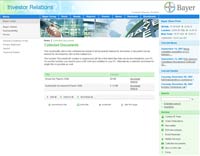
See Bayer for an example, who have a good briefcase facility – letting the visitor collect documents for later use.
Getting the basics right
First things first: your media section (newsroom, media centre – call it what you will) should be available from the main site navigation, not hidden several clicks deep – it needs to be easily found.
A competent media section would contain the following:
- A dedicated landing page for the media visitor. Again, not every company goes for landing pages, but I think there are benefits – you can provide focused content and deeper links for that section of your site, helping people to find what they need quickly. If you’ve got your search engine optimisation sorted, this page will become the landing page (‘arrivals’ page) for those visitors, becoming the ‘go-to’ place for information about you.
- News releases for at least the last year. This would help the visitor get a quick overview of what has been going on in your company recently – and what you’ve said about the key issues.
- RNS releases. All listed companies in the UK (including those listed on the Alternative Investment Market) must first release information that might affect the price of their shares through a Regulatory Information Service to ensure equal access. If these are mandatory for your company, then these should be provided on your website, and are usually listed separately from the standard company news releases.
- A ‘Company-at-a-glance’ feature. Summarise your company’s key facts and figures, with a few paragraphs that explain what you do. Make it easy for your journalist visitor to explain your company to someone else … nothing wrong with a bit of cut and paste if it helps you put your view of your company across.
- Image download facility. As a minimum, this should contain images of the board members, and perhaps company locations and a product shot or two. What is a journalist going to use to illustrate a story about your company if you don’t provide something suitable?
- Company logo – both in black and white and in colour – three sizes and high resolution, please.
- Email alerts. People are busy, and just perhaps, checking your company’s site isn’t top of their priority list today. Make it easy for them to keep up to date by helping them sign up to your alerting service. Send them emails when your site has news.
- Corporate events calendar. This should be kept up to date – otherwise, your company also seems out-of-date with poor attention to detail. Not a good look.
- Company reports. Look at it this way – the more people download your company reports, the fewer you have to print. It’s a cost-saving, as well as providing people with key information quickly. And, to make your visitor even happier, have your company reports available online (in HTML, not PDF) – then they don’t have to print them either.
- FAQs. Providing the answers to the common questions that can be answered quickly and easily in a paragraph or two is also a benefit to you and your staff, as they won’t have to answer the phone to the same questions all the time. But ….
- … do provide contact details. There will be questions that your FAQ can’t answer, so provide a way for your visitor to contact you to ask that crucial question. As a minimum, these contact details should be a phone number, an address, and an email for your PR people.
Click image to see bigger version
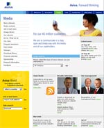
Aviva’s media centre RSS feed, biographies, glossary – everything you might need.
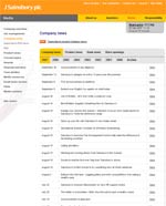
Sainsbury – news releases by year and theme Very easy to track down that missing information.
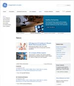
GE media centre Main image shows what other people are saying about GE
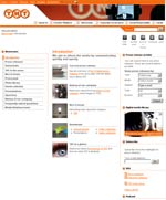
TNT media centre Note the podcasts and the ‘nice to know’ feature.
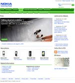
Nokia – signposting a webcast Clear reminder to tune in for the webcast.
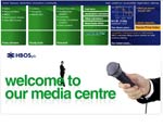
HBOS media centre Welcoming the visitor
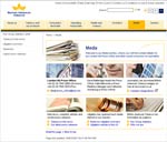
BAT – discussing litigation in their industry up front
These are the minimum requirements for a competent Media section – yet a few companies, even in the FTSE 100, don’t provide even this much information. That isn’t you, is it?
Next: Going up a gear – media section part 2
Lucy is Editor at Corporate Eye
