“Your corporate website is increasingly the soul of your recruiting process. And as you know, it’s not a one-time effort but a continuous improvement process that demands a fair share of development and analyses.” That’s the opening of the descriptive blurb for a session at Kennedy Information’s upcoming Recruiting 2009 Conference and Expo.
Since I think those two points are absolutely correct—it was a surprise to find that this single session is the only mention of the corporate Careers website in the whole conferences agenda, which covers more than three days of sessions, keynotes, workshops, intensives, and summits.
That’s not to say the topic won’t come up in other discussions at the conference, but from the agenda standpoint, it certainly seems to be in an isolated position. The ERE Expo for Fall 2008 also had just one session focused on the corporate website, and the Kennedy Conference in Fall 2008 had none.
So I started to wonder why the “soul” of the recruiting process isn’t getting more attention in these venues—and I still think that’s a very good question. But before I could start looking for answers, I noticed that one of the speakers involved in the Kennedy session (which is a panel discussion) was the Employment Manager for Cirque du Soleil.
How fast do you think I got to their site?
Some of you have already been there and back between the last paragraph and this one, I’ll bet. Because we ALL want to run away and join the circus. Plus—one just has to be curious about how an over-the-top fantasy factory like Cirque would design their Careers website.
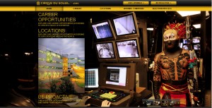
Well, I’m not sure what I expected, but it wasn’t exactly what I found. The site is a bit more boxy than I imagined, for one thing, and although the Home page is madly visual, the secondary pages are basically text on white. There’s an image slideshow running on each page, but it’s rather small.
On the other hand, the unusual color scheme definitely sets it apart—and the functionality is top-notch. All the right information, nicely accessible. And there is certainly enough of the unusual to convey a sense of Cirque.
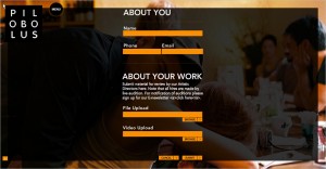
So what about some other exotic employers? Of course Cirque has a huge operation, so they hire all kinds of people. Pilobolus, on the other hand, is a small organization, and it’s all about dancers. But, yes, they do have a sort of miniature Careers page (Menu, Contacts, Work with Us), tucked into their absolutely stunning website:
That’s actually something any employer can do, by developing a site that reflects what’s special about the company. Just look at one of my favorites, Umpqua Bank, for an example that’s not exactly exotic, but still very distinctive and inviting.
Cynthia Giles has followed a serpentine career path from academia to publishing to marketing and design to information technology and corporate communications. There’s plenty of detail about this journey at www.cynthiagiles.com, but briefly--the common theme has been ideas, and how to present them effectively. Along the way, she became an accidental expert on data warehousing and business intelligence, and for the past ten years she has combined corporate contracting with an independent consulting practice that focuses on marketing strategy for smaller businesses and non-profits.
Having spent quite a bit of time looking for work, and anywhere from two weeks to two years inside a wide variety of American companies—she has given much thought to what works (and what doesn’t) when it comes to creating a great employment fit.


