 Stop the presses! Readers are expressing their opinions on the Fortune list of ‘100 Best Companies to Work For’ — and the range of comments is a reminder that beauty is in the eye of the beholder. Though some folks express enthusiasm for their listed companies, others said something like ‘How could you put Company X on this list???’ (And often enough, different people are saying opposite things about the same company.) Another big response category is ‘What about my company?’ or the variant, ‘What about Famous Company X?’
Well, as promised, today’s episode will be notes from my tour of the Careers sites for companies from the list, focusing on ways to energize the employer brand. But the comment-fest at Fortune is irresistible reading—and offers some useful insights–so I’ll post a follow-up soon.
Starting off: I set a goal to visit the Careers sites for half the 100 companies. Didn’t make it! But I did get through quite a few, and have decided that 25 is the new 50. Based on the adventure so far, I have three overview observations:
- Too much video is . . . too much. After the first dozen companies, I felt like I was channel-surfing instead of web-surfing. It takes the visitor time to view each video, and soon you’re feeling like a passive audience rather than an active applicant. So–now that website video is no longer novel–look for fresh, meaningful ways to use it, rather than just putting up obligatory testimonials. (Chesapeake Energy sets a good example.)
- Location of access to the Careers page from the home page and menus is important. When you see a prominent link in the top or side navigation, the message is ‘jobs/employees are important to us.’ When you have to search out a tiny text link at the very bottom of the page, you get the opposite impression. (There can be challenges on this point for some companies. I’ll talk about integrating the Careers page with other site components in a future post.)
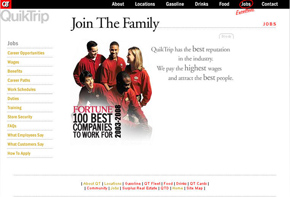
- Message fragmentation is the problem I found most frequently in sites that don’t energize. If the visitor has to click on ten different links to see ten different kinds of information, the energy deflates rapidly. So if you need lots of pages, keep the core message focused, make the navigation very clear, and give visitors a logical path rather than just a pile of links. (QuikTrip and Arnold & Porter both do a good job on this, in different ways.)
Wrapping up: Here is ‘Cynthia’s List of 5 Interesting Company Career Sites.’ Out of the sites I visited in this blitz, here are the ones I fell for. They are good examples, I think, of creating positive energy for the employer brand.
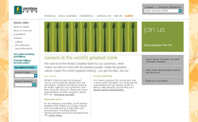
- Umpqua Bank: Their whole site is so charming that I considered moving so I could bank with them. The Careers page highlights unusual perks, such as paid time for volunteer work.
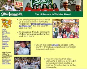
- Stew Leonard’s: The Careers page for this small grocery chain made me laugh and cry. (Really.) The use of snapshot-style photos to illustrate each of the ‘Ten Reasons”’ creates an emotional connection, making the company’s benefits seem personal rather than abstract.
- Starbucks: Although I’m a major Starbucks enthusiast, I think their Careers site could be better. But the approach of creating a ‘Career Center’ works well from an energizing perspective. The site is visually active and information-rich, with a good brand fit.
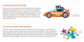
- Zappos.com: In a class by itself! This quirky site makes the list not just for the Core Values Frog (though that’s a hard one to top) but also for clever use of social media.
- Alcon Laboratories: I was determined to find a big company with an energetic Careers site, and it wasn’t easy. But Alcon finally won me over with a bold, blog-style site that steps outside the typical corporate look without losing its dignity.
And FYI: If you’re wondering how I picked my visits—I went to every company with a Q in the name; three companies I really like; three I really don’t like; several I thought would be fun; and a random selection of law firms, construction companies, communication giants, etc.
Cynthia Giles has followed a serpentine career path from academia to publishing to marketing and design to information technology and corporate communications. There’s plenty of detail about this journey at www.cynthiagiles.com, but briefly--the common theme has been ideas, and how to present them effectively. Along the way, she became an accidental expert on data warehousing and business intelligence, and for the past ten years she has combined corporate contracting with an independent consulting practice that focuses on marketing strategy for smaller businesses and non-profits.
Having spent quite a bit of time looking for work, and anywhere from two weeks to two years inside a wide variety of American companies—she has given much thought to what works (and what doesn’t) when it comes to creating a great employment fit.


