 I know it was a marketing email from a stranger, but when I received 3 emails last week with a subject line of ‘Bet you’ve never seen a law firm website like this!’ I couldn’t resist clicking through. After all, looking at corporate websites is what I do.
And at the other end of the link was an interesting site. Quite a long way from my usual website diet, but worth noting for the following reasons:
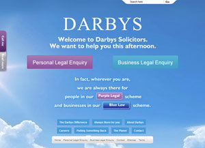
- the background image and welcome message change depending on the time of day.
Not unusual across the web, but it is an unexpected touch for a law firm, and is very nicely done, with good quality images and understated time-framing.
“We want to help you this morning” implies I would receive a speedy response – and most of their visitors are no doubt in a hurry.
- the content is written in layman’s style (not law-speak) and many of the links are visitor- and problem-focused.
For example: ‘you’ve been arrested’ or ‘a client of yours is in financial difficulty’.
This makes it easy for the visitor to find the information they need. Writing content from the visitors point of view – not the internal point of view – is important. Visitors arrive with a problem they want to solve, and neither know nor care what you call the solution.
- the content is informative and helpful.
They’ve done a good job of case-studies across the site, and the explanations—for example, of what happens when you’ve been arrested—are clear and likely to be useful. (I wouldn’t know!)
- the images are well-chosen: mostly the site depends on the background image for visual appeal, which seems to be a trend at the moment. Where there are images, these are pleasant stock images—I like the umbrella theme.
- the structure, and therefore the navigation, is unusual.
The home page clearly marks the different directions for visitors—personal customer or business customer—and the ‘corporate’ pages are available across the site (for the most part). Once the visitor has made a choice, there are further choices to identify the specific problem that the visitor has, at which point they are introduced to the appropriate members of the team. The process goes:
- personal or business?
- if personal, there are 16 choices – let’s choose, say, ‘defending you’
- if ‘defending you’, there are 7 choices – one of which is ‘you have been arrested for an offence’
- if we choose that one, then we arrive at a landing page with:
- information about what happens in the police station
- case studies of people they’ve helped
- a ‘meet the team’ section with good biographies
- information on paying for their services
- and more.
So the case studies and team profiles are tied to the visitor interest, rather than being grouped together, as we might typically see.
And – to go back to the content point again – they are written in an appealing and understandable manner:
- Case study: “Our client was arrested for the first time in his life following a tirade of abuse and threats which he received from a group of lads during a night out at his local snooker club with his friends.”
- Biography: “He has acted for many clients and companies of previous good character charged with offences for the first time and with much to lose.”
The unusual structure does make it slightly harder to navigate, and there’s little cross-site navigation. But then, most visitors aren’t interested in that: they just want a solution to their specific problem.
It’s not perfect, and there are a few snags: a couple of formatting issues and minor typos, some grammatical infelicities, and some difficulties in navigating, depending on which device you’re using to view the site. But overall, an interesting site to review.
Did the marketing work?
I don’t think that law firm websites are necessarily the pit of turbid grandiloquence that stereotyping would suggest. No doubt there are some stodgy ones out there, but a quick scan reveals other decent law firm sites. So the email was perhaps playing up the stereotype.
And I’m not sure why I received the email – still less 3 copies of it – but I’ll certainly remember that the firm exists. So to that extent, I’d say that the email lure did what was hoped – and maybe more, since here’s the link to the Darbys website, so you can review it yourself…
Lucy is Editor at Corporate Eye


