The old adage is that a picture is worth a thousand words. When you translate that into stock charts, you can rephrase that to come out, “A well constructed graph is worth a thousand data points. (For people really interested in this stuff, see “The Visual Display of Quantitative Data” by Edward Tufte, Graphics Press, or visit www.edwardtufte.com.) The thought behind all this is that there are a number of things that companies can do to make their stock price charts more informative.
First, some contradictory thoughts: Avoid the overuse of color, and, consider the use of color to help highlight information. By this I mean that good visual design for charts often means first stripping away meaningless color that junks up the chart. Once visual clarity has been achieved, the judicious use of color to draw attention to information that might otherwise not get noticed can be helpful.
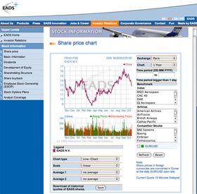
I’ve set out the share price chart from the EADS site. It’s quite nicely done in that it has a clean, white background with a faint grid to help the viewer orient themselves as to price and date. Below that, the volume chart uses color to illustrate the volumes on days when the share price rose (green) versus days when the share price fell (red).
Note also that the page allows for a number of viewer options, including choice of time periods or customized dates, comparisons to indexes, competitors and major customers, scale and moving averages. To top it off, they even provide for downloading of historical quotes, all in one neat and efficient package. To me this is a very well designed page. Everything is where you can see it, eliminating the need to go through menus and click through pages.
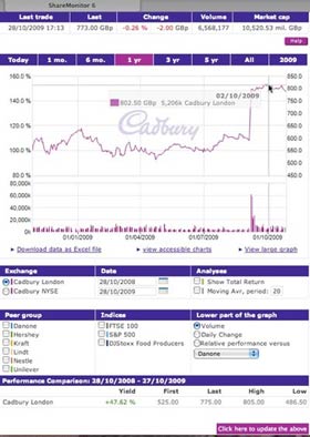
Another chart that utilizes an element I like is the Cadbury share price chart. (In this case it is emphatically not their use of color, although I am purposely steering clear of the color issue here as I learned earlier that criticizing Cadbury’s use of the color purple is a hot button with certain U.K. readers.) Cadbury builds into their chart an interactive feature that pops up the date, price and volume as you scroll over the chart. Given that the graph draws a vertical and horizontal axis as you scroll, Cadbury could even eliminate the grid on the stock chart, faint though it is. Now if they would just add in a feature that also popped up major corporate announcements had been made, it would be close to perfect.
In this series:
Previous post: Historical share price information
Next post: Financial information
Lucy is Editor at Corporate Eye


