There is an old saying that “You never get a second chance to make a first impression”. As if that weren’t a daunting enough thought, the journalist Malcolm Gladwell, in his book Blink: the power of thinking without thinking claims that people make many important decisions within the first two seconds of viewing an object. The implication for investor relations web sites is clear: the first view a reader gets of the investor page is crucial in how they will think about the company as an investment.
First, a word of caution: Investor relations sites operate under the constraint of having to use the overall design criteria for the firm’s entire web site, so visual ‘look and feel’ are not what I’m referring to here. Rather my concern regarding first impressions relates to the completeness, logic and clarity shown on the initial page.
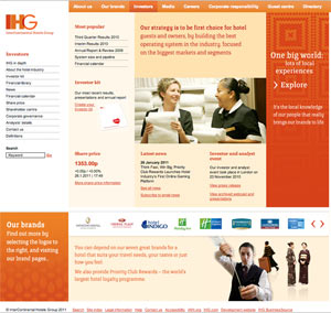
There are many ways to go about this, but one I like is the Investor home page of the Intercontinental Hotel Group.
As seen here, the first page has a menu on the left hand side that not only lists standard items such as share price, news and financial information, but also has sections on IHG in depth, About the hotel industry and Definitions. Parts of the page are also devoted to the firm’s hotel brands, most popular investor information sections and a brief description of the firm’s strategy.
To me, it makes a great first impression; everything is where you can find it, not a lot of hunting is involved and it seems pretty logically laid out. The icing on the cake is that it goes beyond the mere requirements of regulations in discussing the company, its brands and strategy.
My conclusion is that this is a well thought out investor home page, although I will confess that it took me more than two seconds to come to that conclusion (sorry Malcolm Gladwell).
In this series:
Previous post: Acquisitions and Divestments
Next post: Search
Lucy is Editor at Corporate Eye


