Time was, back in the dark ages of about twenty years ago, people only had one option when it came to annual reports – ink on paper. Nowadays we have a multitude of ways to read things: traditional paper, web based, PDF files and e-readers. And people who are visiting your web site to read your annual report expect to have a variety of ways to access the report. Good investor web site design seeks to incorporate a variety of delivery methods for their investors.
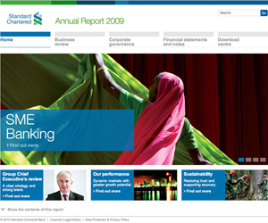
A nicely integrated approach for delivering both a web based report and the ability to download PDF files of the report is demonstrated by Standard Chartered, the financial services company. They start with an electronic cover page, which allows you to navigate to various sections of the report.
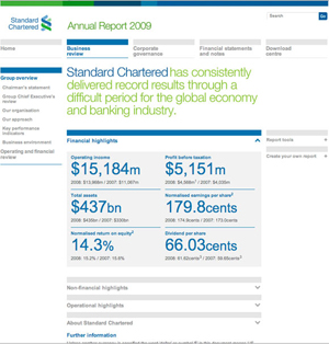
Each section in turn allows the reader to easily get to relevant subsections, whether it be by opening a new page to the Chairman’s statement or by clicking and expanding a sections such as operational highlights. One can easily navigate the report in this web-centric manner.
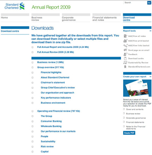
For those readers that wish to read the report in a more traditional, linear fashion, Standard Chartered also provides a download centre. The download centre allows an investor to either choose the entire annual report in a zipped file for quicker download, or pick and choose which sections interest them most for downloading.
In one final interesting piece of design work when you click on the two tabs on the right hand side of the page in the download centre, additional capabilities become visible, such as the ability to email the page or to create a customized PDF file.
Overall, this is a nice piece of design work that addresses the way people navigate for information on the web with the way more traditional readers seek information.
In this series:
Previous post: Annual Reports
Next post: Schedule
Lucy is Editor at Corporate Eye


