Having completed 15 blog posts on what makes for effective investor relations sites, I recently stepped back to look at the topics I’ve written about to see if I had overlooked anything. As I reviewed the various subjects, it occurred to me that I had overlooked one of the things I stress with my students about effectiveness in investor communications. Namely, visibility and its effect on the delivery of a company’s message. In short, you cannot effectively communicate with your investors if they cannot find you.
This may seem over-simplified, but there is a lot of truth to it. Think of the following scenario: an investor goes to a company’s home web page looking for information about a company’s stock. From there, one of two things can happen – he can find the link quickly and happily go on his way or, he can spend a couple of fruitless minutes parsing the company home page looking for something that vaguely looks as if it will lead to an investor relations site. In the end, the investor may wind up having to click on a variety of links before he arrives, somewhat irritated and frustrated, at the investor relations site. You really don’t want your investors irritated and frustrated when they visit your site for information.
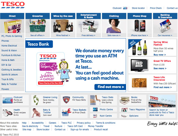
For example, using a common shortcut for web browsing, I typed in “Tesco.com” into my web browser and up popped the Tesco site that I have reproduced below. You can look long and hard for anything that refers to investors on the home page and you won’t find it. You have to figure out that you need to go down to the bottom of the page and click on the link for Tesco plc, the corporate site, before you will find a link for their investor centre.
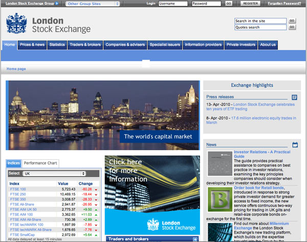
Doing the same thing for the London Stock Exchange yields a similar result, except this time you have to figure out that it is the link at the upper left hand corner you need to click on to navigate to a corporate site with an investor relations page.
It is understandable why some entities have multiple web pages, to serve different constituencies.
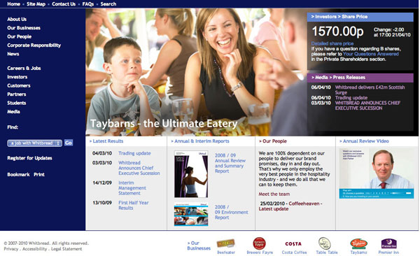
However, when that is the case, it is quite simple to clearly label and direct visitors to the appropriate site. The most effective way to design your main page is to have a list of links either at the top of the page or along the left or right hand side of the page, where visitors can quickly figure out where to go. For example, the screenshot below shows the Whitbread home page with an easily navigated list down the left hand side.
Simplicity and good design can avoid a lot of grief.
In this series:
Previous post: Blogs
Next post: Making the individual shareholder feel welcome
Lucy is Editor at Corporate Eye


Exactly! Also I’d venture to guess that most people don’t know that meta tags don’t matter much any more. Crawlers look for titles and text. Physically submitting your website to search engines periodically helps too.