At the heart of understanding a company is the ability to parse the financial statements, which are chock full of great information. However, one of the problems with the financial statements is that the information is scattered among the income statement, the balance sheet and the cash flow statement. A further problem with the financial statements is that they are often considered as stand alone documents, with very little interaction of the information between the income statement, balance sheet and cash flow statements. A final issue of the financials is that they are data-dense, and don’t easily give a clear picture of inter-relationships of the data and the evolving picture over time.
This is where graphs come in. Properly constructed graphs can show not only what has been happening over time, but also how various components relate and interact. So it is surprising that so few companies have web sites that help investors construct graphs from the financial data. I’m not quite sure of the reason for this. It could be that companies figure that professional investors with expensive subscription services to data have the ability to do this on their own, or it could be that they simply haven’t thought about it. In either case, I believe they are missing a great opportunity.
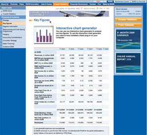
By making graphing capabilities easily accessible to web site visitors, companies can make life considerably easier for investors and highlight areas that they consider important. For example, EADS, the defense contractor, creates a section on their web site entitled “Key Figures”, a screenshot of which is on the right. As you can see, the page contains plenty of data, but unless you are prepared to do a bit of analysis, either with a calculator or by reentering the data into a spreadsheet, it’s tough to get a clear picture of what is going on.
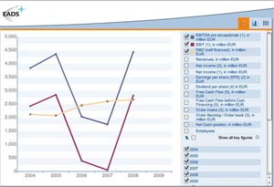
Fortunately, EADS has a function on the page called “Interactive Chart Generator” which helps. If you go to the chart generator, you can quickly construct graphs such as the one here, showing the relationship between EBIT and R&D in order to see if EADS continually reinvests for the future or whether they cut back in the tough years.
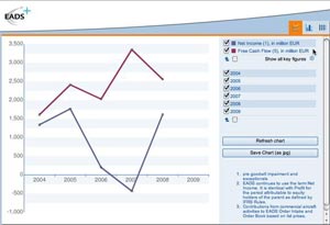
Another favorite of professional investors is to look at free cash flow generation as a double check on net income. I was able to construct the graph below with about six clicks of my computer mouse.
All things considered, the Interactive Chart Generator is a very effective tool to help your investors quickly understand some of the key trends in your financial information.
In this series:
Previous post: Provide context
Next post: Interim results
Lucy is Editor at Corporate Eye


