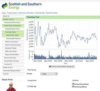
Last week we focused on immediate share price information and today we will be looking at stock charts. At its very basic, a stock chart should clearly convey the price history of a stock over a defined period of time. So at a minimum, a line chart over the past year with a clearly defined axis showing the price is what investors can expect. Most companies also include a volume chart below the share price. Scottish and Southern Energy has a nice example of this simple approach and I’ve reproduced it below.
You will note that the charting page for Scottish and Southern Energy also includes a selection tool that allows investors to select the time period that they wish to view, ranging from intraday to five years in length.
This is the next iteration of choice for price charts and very helpful for someone thinking about purchasing the stock.
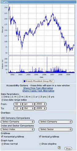
Taking it one step further, some companies also allow user selected dates to define the beginning and end of the chart. This makes sense for people who already own the stock as chances are most investors did not buy the stock on the one, two or five year anniversary of their looking at the chart.
A good example of this capability is the chart of Friends Provident Group, reproduced below, where I’ve arbitrarily chosen to look at the share price performance since the beginning of the year 2000.
 A close inspection of the chart will also show that investors have the capability to chart against other companies (in this case, up to eight pre-selected companies), indexes and sectors.
As an investor, this is useful, because you always want to know “Compared to what?” however, it probably comes under the “Nice to have“ category as opposed to essential information.
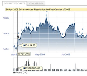
Finally, a feature I really like, but which I don’t see that often, is illustrated on the chart from ENI. (If you really want to see a well-executed investor site, visit ENI’s site www.eni.it.)
They have overlain their interactive chart with indicators of the release of corporate information. For example, by scrolling over April 24, 2009, you are able to see that the rise in their stock price coincided with the release of ENI’s first quarter 2009 results.
I find this particularly helpful when I look at a large rise or fall on a stock price chart as it often helps me understand what may have been causing the movement.
In this series:
Previous post: Share price information
Next post: Historical share price data
Lucy is Editor at Corporate Eye


