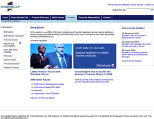
Having started with the premise that an effective investor web site should give a clear and concise description of what your company does, the next logical thing to do is to provide an easy-to-use roadmap of where the relevant information lies. Most companies choose a format that places a column of links or tabs in either the upper left or right hand side of the main investor relations page. Set forth below is an example of this type of layout as used by Standard Life.
In looking at a number of websites, I could discern no standard list of what linked sections appear or in what order they are listed. Given that the objective is to enable investors to get the information they need quickly with a minimum of hunting, I would suggest that effective websites think in terms of priorities.
First, certain things are essential to investor relations and an understanding of the company and therefore access to your share price, financial statements annual and interim reports and press releases should be considered a first priority and go to the top of the list.
Of next importance are more discretionary disclosures such as investor presentations, Webcasts, upcoming investor events and the company’s financial calendar. Links that help answer questions for specific groups of investors, such as debt holders or information for individual shareholders administrative items are the next priority that should be included.
Finally, depending on the inclination of the company, the composition of its investor base, and a myriad of other factors, there are links to more specialized information that may prove helpful, such as Corporate Social Responsibility (often seen as a section on its own), corporate governance (also often seen as a separate section), links to the Annual General Meeting materials, and, in the United States, links to Securities and Exchange Commission filings.
Because the subject headings are not uniform and information is often buried two or three links deep, I am a proponent of the use of popup menus as you scroll over the list of links. This enables a visitor to quickly see where information has been placed. It also helps avoid the back and forth hunting for information and waiting for web pages to load that often happens when you click on a promising heading only to find that it doesn’t lead to the information you want. It turns out, that on the web, as in life, you can’t tell a link by its cover.
In this series:
Previous post: What does the company do?
Next post: Share price information
Lucy is Editor at Corporate Eye


