This week, Continental Airlines and United Airlines announced a planned merger creating the largest airline. While the two airlines claim their routes barely overlap and the merger should be completed by the end of 2010, the Chairman of the U.S. House Transportation Committee, Congressman Jim Oberstar has asked the U.S. Justice Department to block the merger. While we wait for the merger to be approved by antitrust regulators and shareholders (and let’s face it — it’s unlikely the merger won’t happen), consumers can already see some of the effects of the merger with a new brand identity and logo — sort of.
First, a snippet about the new brand from the merger press release:
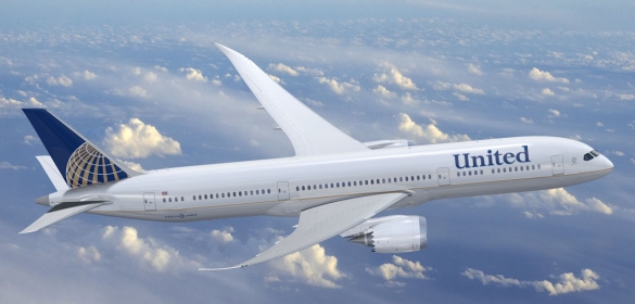
The holding company for the new entity will be named United Continental Holdings, Inc. and the name of the airline will be United Airlines. The marketing brand will be a combination of the brands of both companies. Aircraft will have the Continental livery, logo and colors with the United name, and the announcement campaign slogan will be “Let’s Fly Together.”
Next, a peak at the new logo, which combines the United name with the old Continental icon:

Finally, a look at the new airplanes that look very similar to the old Continental planes with the United name replacing the Continental name.

What do you think of the interim branding solution? Love it or hate it? Would a complete rebrand with a new name and logo unrelated to either of the previous brands have been a better choice?
Of course, it’s still quite possible that a complete rebranding will happen in the year or so following the merger completion, so the question is whether the Continental and United brands have enough value to warrant keeping either. Would consumers lament the loss of either brand? It’s doubtful.
Truth be told, both brands carry a lot of negative baggage (no pun intended), and a complete rebranding could be just the ticket this company needs (again, no pun intended … well, maybe a little).
What do you think? Leave a comment and share your thoughts.
Images: UnitedContinentalMerger.com
Susan Gunelius is the author of 10 marketing, social media, branding, copywriting, and technology books, and she is President & CEO of KeySplash Creative, Inc., a marketing communications company. She also owns Women on Business, an award-wining blog for business women. She is a featured columnist for Entrepreneur.com and Forbes.com, and her marketing-related articles have appeared on websites such as MSNBC.com, BusinessWeek.com, TodayShow.com, and more.
She has over 20 years of experience in the marketing field having spent the first decade of her career directing marketing programs for some of the largest companies in the world, including divisions of AT&T and HSBC. Today, her clients include large and small companies around the world and household brands like Citigroup, Cox Communications, Intuit, and more. Susan is frequently interviewed about marketing and branding by television, radio, print, and online media organizations, and she speaks about these topics at events around the world. You can connect with her on Twitter, Facebook, LinkedIn, or Google+.


According to this quote, this travesty of a logo is here to stay:
Quote from Wall Street Journal:
One thing that has been set is the branding and logo of the combined airline, whose new slogan is “Let’s Fly Together.”
And according to this quote, the CEO’s came up with it all by themselves.
Quote from Wall Street Journal:
The planned marketing brand, the United name and the Continental livery, logo and colors “was agreed between the two of us,” Mr. Tilton said, instead of going through committee.
Here’s other links that offer more insight into this debacle:
http://subjectiveobject.com/2010/05/04/it%E2%80%99s-merged-but-is-it-united/comment-page-1/#comment-152
http://www.sfgate.com/cgi-bin/blogs/abraham/detail?entry_id=62775
http://www.fastcompany.com/1638794/the-new-united-contintental-logo-flying-a-little-too-close-together
http://www.flyertalk.com/forum/united-mileage-plus/1080900-united-adopt-co-globe-logo-livery-lets-fly-together.html
http://www.underconsideration.com/brandnew/archives/the_united_and_continental_airline_mashup.php
http://www.usatoday.com/travel/flights/item.aspx?type=blog&ak=90652.blog#uslPageReturn
My gosh, I seriously dislike the Continental logo and colors…always have. It is like comparing Microsoft and Apple when it comes to brand identity. When you park that new color and logo at Heathrow, Hong Kong, Shanghai, etc…it will look sooo boring compared to the hip foreign competitors.
I think the colors look great! It actually shows a true merger using the UA name and the CO logo. One thing I thought they should have added would be to replace the gray below the gold line with navy blue. But all in all the new brand looks great.
As to the new United/Continental logo – YAWN! Not very exciting, especially when considering the formation of the worlds largest airline. It looks like it was decided by the airline executives themselves in a compromise, which is actually what happened. They merely lopped off part of each and stuck them together. They should have turned it over to someone (people) who create logos for a living. A logo should create positive instant recognition for the new company rather than a memory of things and times past. If one is drawn to the memory of United or Continental, there is a good chance that some bad memories may come up also. If the old logos must be retained for customer continuity, then combine them in a way that is new, creative, forward looking and exciting. Being a United Frequent Flyer, it is more important to me to get where I want to go, when I need to leave and arrive and when promised that I will get there, with a pleasant and comfortable experience. That means good service with no unpleasant surprises or hidden fees.
Now that the new airline has begun “Customer Day One”, they have unveiled a new logo, taking the United name and Continental icon, with a new shade of blue. Begs the question, why not go with something new altogether? Further thoughts found here: http://www.theinstargroup.com/blog/2011/05/18/united-and-continental-airlines-merged-logos/