What do you think about The Network?
No, it’s not the latest dark cyber-thriller, but the newly launched newsroom on the Cisco site.
Unusually, it was launched with a YouTube video with cartoon characters and explosions; I don’t know of any other corporate site section launched on YouTube, do you? (If you do, please let us know in the comments below!)

There’s lots to like:
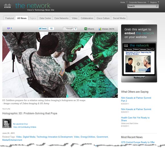
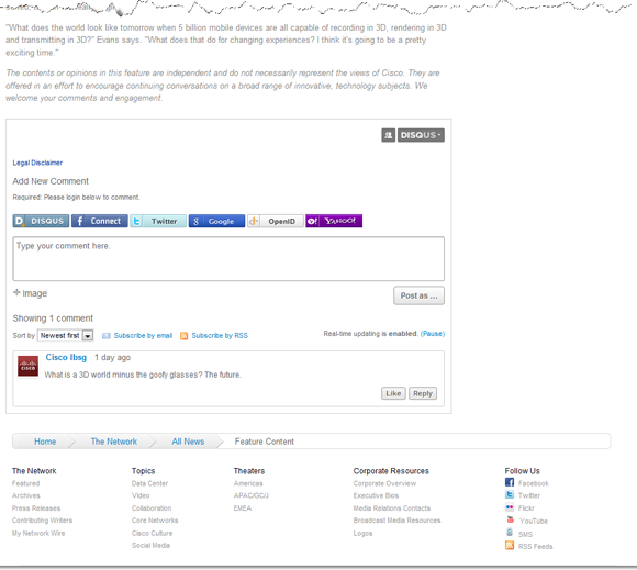
- The design is crisp and clean, and there is a range of good integration of social elements: Facebook, Twitter and Flickr, and a list of links to coverage of Cisco elsewhere. There’s even a widget showing news that can be embedded on your own website, should you want to. And comments are enabled.
- The topics covered are appropriate to the company, and there is an impressive list of contributing writers – each with a bio, links to their own online spaces, and a list of the articles by them available on this site (with dedicated RSS feed available).
- There’s a Topic Page Manager, who is named, and their Twitter handle provided. There’s even an image of each, though sadly, the videos have been removed from YouTube. This is a nice touch, and makes the topic pages more welcoming.
- And on the All News page, there’s a good range of filters, to make tracking down items of interest easier.
When you click through, some of the links go to newly designed pages (press releases and articles), and some (the blog links) to the pre-existing pages. This smart new design does make some of the older pages look a little dated in comparison…
What’s in it for the journalist?
The new press release pages include sections for Related Information (mostly photos) a link to the RSS feed, and Supporting Resources (though on at least one of the releases I looked at, these go to home pages rather than directly to useful information).
Note the record of the number of shares… while I have seen the number of likes, tweets and visits before, a record of the number of people who have emailed the page to another is unusual.
The Press Contacts page is nicely handled, with a dedicated email address and phone number for each contact, and an explanation of their interest area – so the visitor is more likely to find the right person. And the filter option here is a good idea, given the number of potential contacts.
Interestingly, there’s a ‘hands-off’ editorial approach, so it is much more of a news hub than a resource for those wishing to write about Cisco. Their aim is to create, curate and share content on relevant technology content, not simply to spit out corporate press releases.
The corporate resources are available via the footer, or by a small link in the top right services bar, which is where to find executive bios, contacts, and links to request B-roll and logos.
Typically, in a corporate newsroom or media section, there would be an image gallery, with images of executives, products, buildings… Alternatively, images of executives would be available for download with the executive biographies. Here, though, there is a PDF biography available, but not an image. This would seem to be a shortcoming, as it means that there is less that can be picked up and reused elsewhere. This may be part of the plan, though: their aim is to get repeat visitors, and to generate conversation on their site.
The YouTube-hosted videos can be picked up and embedded elsewhere, so it is really only the images that puzzle me. I haven’t found any indication that the images used as part of the press releases and on the site are available for reuse, but perhaps I missed something.
Curiously, the alerting service is hidden behind a small icon in the footer, and is SMS only, not email. Is this part of what seems to be becoming a trend, to reduce the alerting service options?

What do I think?
Overall, I like it, though I do wonder whether it provides enough of a resource for two key elements of their audience:
- journalists looking to cover the company
- bloggers looking to pick up and reuse content on their own sites
It will certainly provide a lot to mull over, for those of you responsible for maintaining the media sections of your own corporate websites.
What do you think? Let us know in the comments below…
Lucy is Editor at Corporate Eye


