Every season has its own kind of beauty, and Winter is no exception. Those pesky leaves that looked so refreshing when Spring came are now long gone, so trees are showing off their sculpted shapes. It’s an annual reminder that what’s underneath is just as important as what’s apparent.
Which is my not-so-subtle way of saying that the fundamental design values of a website are as much a key to excellence as those persuasive videos and clever messages that decorate the surface.
By and large, corporate Career site designs are not exciting. And some are downright dull. In a number of cases that’s just because the design has been around for too long. While business sites can’t be continually scurrying after the look of the moment, they should periodically shake off the dust of outdated design values—not merely because time has passed, but because web design has come a long way fast. The paradigms emerging today are just far better, aesthetically and otherwise, than what could be done (or imagined) in the past.
Here are a few other reasons why dullness happens:
- “Boring” has been mistaken for “businesslike.”
- Stakeholders are afraid to take a chance on something different.
- No one thinks the design really matters.
- The Careers site is tied to a dull corporate design and can’t get loose.
I keep an eye out for signs of changing approaches among the mid-size to very-large companies, but don’t see much yet. While we wait, though, here’s a Christmas card of beautiful sites designed for smaller businesses and creative professionals. Consider them an inspiration!
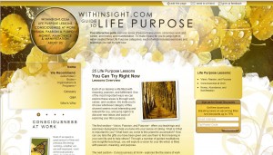
First: A rich, inviting design sets the tone for this thematic microsite, created by Sounds True to showcase related products and content.
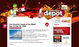
Next, the artful energy of WebDesignerDepot has helped to build a large, enthusiastic audience for the site. And the outstanding content is worth following for anyone who has an interest in design.
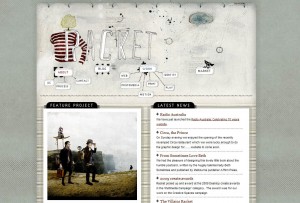
Whimsical charm paints a quick picture of imagination at work, from the Australian design studio Racket.
The eclectic artistry of Peapod creations is perfectly captured in this design. (Mousing over a category produces a ravishing color view.)
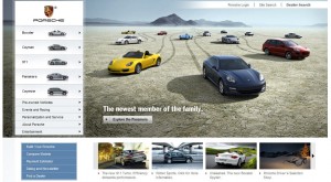
Of course–sometimes all you need is a beautiful product!
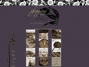
And finally, here’s proof that stand-out colors plus bold simplicity can make even a grid look great.
That’s all for this Christmas. But while we’re exploring imaginative options, here’s food for thought from 37 Signals:
Imagine an employee handbook that just said: “We trust you. Be mischievous.”
(Many thanks to ahisgett for revealing the beauty of winter’s bare branches.)
Cynthia Giles has followed a serpentine career path from academia to publishing to marketing and design to information technology and corporate communications. There’s plenty of detail about this journey at www.cynthiagiles.com, but briefly--the common theme has been ideas, and how to present them effectively. Along the way, she became an accidental expert on data warehousing and business intelligence, and for the past ten years she has combined corporate contracting with an independent consulting practice that focuses on marketing strategy for smaller businesses and non-profits.
Having spent quite a bit of time looking for work, and anywhere from two weeks to two years inside a wide variety of American companies—she has given much thought to what works (and what doesn’t) when it comes to creating a great employment fit.

