Actually, a Careers site is pretty much exactly like a PowerPoint presentation. Which means the answer to this riddle isn’t very funny.
But the answer is important, and here’s why:
PowerPoint presentations (affectionately known as PPTs, or sometimes “decks”) have become the most frequent means of communicating information in many—perhaps most—organizations. And for purposes of discussion, we’ll just lump in niche platforms like the Mac program Keynote and online options like SlideRocket, which are PowerPoint-by-any-other name, even if they are better in some respects.
The result in all cases is basically the same: ideas/information organized in slide-sized “bites.”
Once you start thinking about it this way, a website could be seen as a stack of presentation-like pages, each one displaying several slides—sort of like the Slide Sorter view in PowerPoint. The visitor has self-serve access to these slides, so they can jump around to different parts of the “presentation.”
And now to the point. The rules for creating good slides/presentations are few and definite, but mostly ignored. For example, some excellent rules are:
- Don’t put too much information on one slide—use several slides to build a theme or explain a complex idea.
- Include something visual on every slide—but be sure the visual content is informative, not merely decorative.
- Be consistent in formatting—not only on each slide, but across the whole presentation.
- Provide a clear structure that organizes the slides—and make sure the audience always knows where they are and where they are going.
These rules apply every bit as well to a website design, but are just as often ignored.
Presentation expert Olivia Mitchell takes the psychology of PowerPoint even further in New evidence that bullet-points don’t work. This substantive post explains research that shows improved comprehension in audiences viewing “sparse” slides (strong graphics, little text) rather than conventional slides that combine bullet-point text with smaller illustrations. Mitchell goes into detail on the factors that involved—well worth a read.
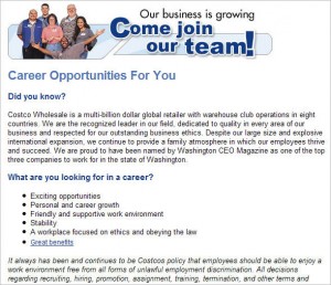
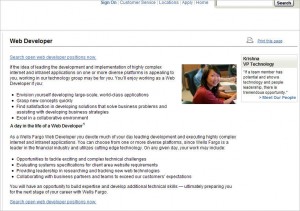
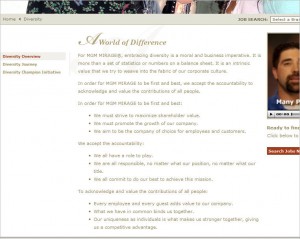
Now in fact, most Careers sites I visit use lots of bullet points and lots of text. To validate this impression, I picked out (completely at random) three big companies in completely different industry segments, two of which I’ve never visited before. Here’s what I found . . .
Costco Careers
Wells Fargo Careers
MGM Careers
This is not a criticism of the three sites—just a confirmation that the bullet-point style is ubiquitous. Like these examples, a great many of the designs I see have a few visual elements around the perimeter, with a big block of text in the middle.
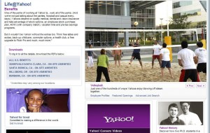
In terms of presentation-style impact, contrast that look with this one:
Yahoo Careers
Since website visitors aren’t getting additional information from speakers, the main ideas obviously must be explained on the page. But breaking up text into thematic zones, putting some information into a graphical format, or even just changing the round, black bullets to (for example) square red bullets would certainly liven up the page.
Replacing boring bullets with interesting ones would be really low-hanging fruit! And there are probably quite a few other tweaks that could improve the “presentation” qualities of a typical Careers site and bring about high-value change.
Cynthia Giles has followed a serpentine career path from academia to publishing to marketing and design to information technology and corporate communications. There’s plenty of detail about this journey at www.cynthiagiles.com, but briefly--the common theme has been ideas, and how to present them effectively. Along the way, she became an accidental expert on data warehousing and business intelligence, and for the past ten years she has combined corporate contracting with an independent consulting practice that focuses on marketing strategy for smaller businesses and non-profits.
Having spent quite a bit of time looking for work, and anywhere from two weeks to two years inside a wide variety of American companies—she has given much thought to what works (and what doesn’t) when it comes to creating a great employment fit.


