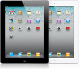
 The current hot gadget is the iPad and other tablets are launching quickly to compete with the iPad. It makes sense that brands would want to revamp their websites so they work well on tablets, but brands like MTV and VH1 are leading a new redesign trend. Instead of simply moving website elements around so they look better on tablets, MTV and VH1 have completely redesigned their websites to take advantage of touch screens, smaller screens, and vibrant screens.
For example, the new MTV and VH1 tablet-optimized websites use less text than their traditional websites. While many brands are simply releasing apps for people to access their web content on smartphones and tablets, MTV and VH1 are betting that some people will want to use apps to access content and others will want to browse the Internet on those devices and consume content in a more traditional way.
The new MTV and VH1 tablet-optimized sites allow anyone with an iPad to view those sites through their tablet web browser function without opening a separate app. For casual visitors, this is a big benefit. While all functions on the full websites aren’t available on the iPad-optimized versions, there is a good variety and one can expect more features are coming.
Currently, the content on the iPad-optimized MTV and VH1 sites are heavy on video, as you might expect from both brands. In other words, the iPad-optimized sites are excellent representations of both brands. Already, Starbucks has signed on for a rich-media ad campaign.
While many companies are focusing on creating tablet apps to deliver their content on iPads and other tablet devices, MTV and VH1 are choosing to cover all their bases and offer great content to all types of visitors. As the tablet user base expands beyond tech-savvy early adopters, this sounds like a wise strategy.
What do you think? Should companies create branded tablet apps as well as tablet-optimized websites, or do you think apps are enough? Leave a comment and share your thoughts on this tablet trend.
Image: Apple.com
Susan Gunelius is the author of 10 marketing, social media, branding, copywriting, and technology books, and she is President & CEO of KeySplash Creative, Inc., a marketing communications company. She also owns Women on Business, an award-wining blog for business women. She is a featured columnist for Entrepreneur.com and Forbes.com, and her marketing-related articles have appeared on websites such as MSNBC.com, BusinessWeek.com, TodayShow.com, and more.
She has over 20 years of experience in the marketing field having spent the first decade of her career directing marketing programs for some of the largest companies in the world, including divisions of AT&T and HSBC. Today, her clients include large and small companies around the world and household brands like Citigroup, Cox Communications, Intuit, and more. Susan is frequently interviewed about marketing and branding by television, radio, print, and online media organizations, and she speaks about these topics at events around the world. You can connect with her on Twitter, Facebook, LinkedIn, or Google+.


I think it’s too broad a question to give a definitive answer. For many sites, simply having an HTML5 based site with an interface that is touchable and immersive will be enough. Apps really come into play when you need to take advantage of the native speed of a device or better access to hardware.
I am personally hoping we don’t see a trend where there is a Desktop browser based site, tablet site, and mobile site. I think we would all be better served if (most times) desktop and tablet were the same site.