There’s actually a good story about how I came upon today’s topic, but I’m going to save it for another post. (Just remember “Company A.”) For now, I want to zip right on to the silly stuff!
Or let’s put it this way: Given the proposition that recruiting should express a company’s personality—how do you deal with a corporate image that’s quirky, or even downright comical? Should you embrace the humor, play it straight, or go somewhere in between?
(And in case you’re thinking “if only that were my problem,” don’t stop reading. There are some lessons here for seriously dull businesses as well.)
Let’s start by looking at two companies that put a lot of money into making people laugh at their brands. Ask most people for one word about Jack in the Box commercials, and the answer will be “funny.” Same thing for Geico. When job-seekers go to those company sites, they take the humor association right along with them—and it may be a bit of a turn-off if they find an impersonal, unfunny page.
But neither company is recruiting for comic talent, and job-hunting is not by nature a humorous topic. So the key would be to bring the brand together with the mission. Enough Jack, but not too much. Just a touch of Gecko. And the balance needs to fit the business.
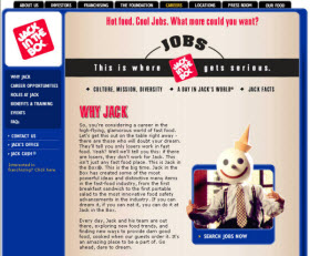
For the sake of full disclosure I’d better report at this point that I’m in the tank for Jack. If he’s on TV, I stop to watch, and I never get tired of analyzing the really great Jack moments. (Hint: It’s all about the mouth.) So I’m happy to report that Jack hits the mark on recruiting, with a site that perfectly captures “his” personality through conversational text and iconic illustrations.

Three things to notice: First, attention to detail. For example . . . in some browsers, when you hover on a navigation tab, a Jack antenna-topper pops up above the tab and starts turning his head back and forth. Yes, really! (All across JITB messaging, details sustain the illusion that Jack’s world is an actual place, which is a large part of what makes it all so funny.)
Second, appropriate balance. The “Why Jack” page is LOL funny–I’ve read it about five times now—but it also delivers some solid points. The trick is skillful comic writing that combines tongue-in-cheek delivery (“This is the big time.”) with substantive messaging (“from the first breakfast sandwich to the first portable salad to the most innovative food safety advancements in the industry”).
The “FAQ,” “Benefits,” and “Roles at Jack” pages are written in a crisp, direct style that signals serious business, but each one has a Jack photo, so everything fits together. And notice that every photo on the site neatly fits its page, to reinforce the key message. So Jack’s a high-flying executive on the “Roles” page (read: road to success), but on the “Benefits” page, he’s fly-fishing (read: quality of life).
Finally, the third thing. As they say in show biz, if you want to get around an inconvenient or unlikely plot point, “hang a lantern on it.” So JITB gives the Careers section a special header: Jobs. This is where Jack in the Box gets serious. And that neatly resolves the dissonance problem.
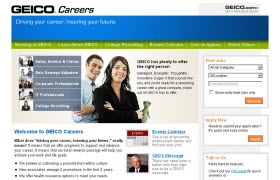
All right—now what about the Gecko? Over at Geico, they have a different set of constraints than JITB, since you just can’t be as playful about car insurance as you can about fast food. So the site itself is stick-straight. But on the landing page—exactly in the very center—there he is. And wouldn’t you have been disappointed otherwise?
Some takeaways for the rest of us:
- Be true to your brand personality.
- Be consistent across pages, but don’t be boring. Use appropriate variety.
- Remember these famous last words, even though no one can remember who said them: “Dying is easy. Comedy–that’s hard.” It may be okay to add a touch of humor to your site, but make sure it works!
Cynthia Giles has followed a serpentine career path from academia to publishing to marketing and design to information technology and corporate communications. There’s plenty of detail about this journey at www.cynthiagiles.com, but briefly--the common theme has been ideas, and how to present them effectively. Along the way, she became an accidental expert on data warehousing and business intelligence, and for the past ten years she has combined corporate contracting with an independent consulting practice that focuses on marketing strategy for smaller businesses and non-profits.
Having spent quite a bit of time looking for work, and anywhere from two weeks to two years inside a wide variety of American companies—she has given much thought to what works (and what doesn’t) when it comes to creating a great employment fit.


this is a great post and brings up a good point about humor in the workplace. Every job has some sort of humor somewhere. If not it would be just miserable go to work everyday. I think humor on the website actually shows the applicant that it would be an enjoyable experience to work there.
Glad you enjoyed the post, Click and Inc! I suspect that many companies will want to appear extra-serious in these times of economic challenge. But as you point out, a touch of humor creates an optimistic impression–and that could actually have a lot of value right now.
I think there is an aspect of this that deals with the type of candidates the companies need to attract. Jack in the Box has a significant number of lower paid, hourly type workers that tend to be younger. Their website has struck a tone that seems to focus on that demographic from a marketing perspective, whereas Geico is focusing on a more professional image (and probably candidate).
I’d be curious to find a company website that is targeting mostly professional-level talent, but doing so with humor and levity.
Thanks so much for your comment, Aaron. That was one of my first thoughts too about Jack in the Box–but I was surprised when I explored the site. It’s used for all types of positions, including professional. Home, Why Jack (the funniest part), and Benefits would be the same for all visitors, then on the Roles at Jack page, they can choose from Restaurant (job descriptions for team members, managers, etc.), Corporate (a long list that includes IT, HR, R&D, accounting, etc.), and Distribution. So I think the JITB messaging may be driven more by brand fidelity than by demographics. But I definitely agree with you that humor has to fit the audience!
Actually, the key thing about the Jack site may not be so much that it’s funny, but that it’s interesting. Although the Geico site isn’t funny, having the Gecko there adds interest–and differentiates from the competition–so it works well in its own way, without losing the professional tone.
Most of the sites I looked at for this post were both not funny and not interesting, but I’ll keep looking and if I find any that break out of the box, will do a follow-up.