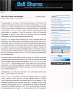
 As I’m sure you know by now, Dell launched the first Investor Relations blog just over a week ago, to quite a bit of comment around the patch, and they’ve got a couple of posts up now.
This blog is a really very interesting addition to the IR site, and Dell are typically brave to be the first (though I suppose someone has to!). I’m sure it won’t be long before other companies join them …
I’ve been across to visit a few times, and have a couple of comments:

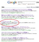
- The first slightly odd feature is the page title shown on the results of the Google search. This page title (“Community Server”) comes up again as the page title on the home page, though further into the blog the page titles become the post titles. It also appears on the tabs of my browser (Firefox). This should be easy enough to change – unless Dell have actively decided that the page title here should be “Community Server”, rather than, say, “Dell Shares”?
- Secondly, there is the much-discussed waiver page. Dell say that this will only be visible once a month … in my experience, though, it comes up on every visit. Dominic Jones brought this up in the comments, as it is obviously happening to him too. It isn’t a huge problem, rather a minor inconvenience, but I do hope that Dell decide it isn’t necessary soon.
- It is great to see some FAQs in the sidebar – this is a good idea, as are the links to the other Dell interactive elements, such as the IdeaStorm site, the forums, and the Direct2Dell blog. But why not add some links back to the main investor relations site, too? After all, there will be a great deal of relevant content on the main site, and it is possible that people will arrive at the blog first, particularly as it grows over time. The main site links to the IR blog – and the IR blog feed has been added to the list of feeds available from Dell, so they have been careful to get the initial integration of the blog sorted out.
- The collapsing elements in the sidebar, such as the recent comments, are a nice feature, though I notice that they aren’t consistent. Some of those links don’t expand on clicking, but bring up a new page, such as the FAQ, and the Terms and Conditions. I wonder if simply rotating the icon at the left of the link from the up/down position to the left/right position might be enough to communicate that these links act differently?
- And I really like the way that clicking on the author’s name (Lynn Tyson), at the bottom of the post, brings up her biography.
Overall, then, I like it, and I think it will be a good role model for other companies thinking about doing the same. It will inevitably evolve, as blogs do, but it will be interesting to watch.
Note to self: review their blog in six months, to see what has changed.
Lucy is Editor at Corporate Eye
We have been successful with this blog havent we?
Hi Neotome – yes indeed. Hard to believe that was well over 2 years ago, isn’t it?