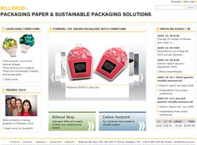
As part of a research project into the websites of packaging companies, I came across Billerud’s corporate website.

Click image to enlarge
Billerud is smaller than many of the companies whose sites I usually study, but there are many excellent features nonetheless.
The first thing that I noticed was the copy.
The home page is a fairly typical corporate-style box-based site with teasers to lower level pages, but the main focus of the page is on a particular product, with a focus box highlighting images of the new product, and marketing-type language rather than a more corporate style…
“Think smooth, round and natural shapes.
Think striking and creative.
Think environmentally friendly and sustainable”
This is sufficiently different that it stands out from the norm, and the language used elsewhere on the site is also interesting. For example, on the Environment page, the company has chosen to explain why their industry is both important and responsible in ‘layman’ language:
The Swedish forests are expanding at a record rate. Since 1945, they have increased almost 50 per cent. At the same time, every year it has been possible to extract more and more timber from the Swedish forests. The Swedish forest industry replants more forest than it fells, and for every tree felled, 2-4 new ones are planted. We are thus not running out of wood.
And on the products pages:
Containerboard is one of the world’s most used packaging materials. It is strong, durable, lightweight, environment-friendly and cost-effective, which makes it perfect for everything from strong, stiff and impact-resistant transport packaging to smart-looking consumer packaging featuring advanced printing. It’s a fact that 90% of all consumer goods are packed in containerboard cases at some stage during transportation.
Billerud’s containerboard, both the corrugated middle layer (fluting) and the outer layer (lining), is made of 100% primary fibre. That ensures a clean and very strong paper used in the most demanding applications. When there are extra requirements for strength, purity, hygiene and good printing, Billerud’s liner and fluting make an excellent choice.
This kind of language doesn’t use jargon, will be easily understood by most visitors (12.58 on the Gunning Fog Index for all the Billerud text quoted here), explains the benefits of the product, the significance of the industry and reiterates the environmental benefits as well – an important feature for this industry. And it appears trustworthy and authentic.
Why can’t all corporate sites be written this clearly?
Now, this site is clearly multi-purpose, in that it is targeting purchasers as well as the more corporate visitor, but it isn’t just the product pages that are easy to read. A quick look at the Corporate Governance section (usually the most difficult part of a corporate site to read) shows that the links to the usual Terms of Reference documents are rephrased as ‘Work Instructions’. And in the Careers section:
Our attitude to each other and to our environment is characterised by respect, openness and reliability.
Openness, respect and innovation lie at the heart of all activities performed by Billerud. Everything we do must also be of the best quality, and that applies not only for our products but also for external contacts and the work we do internally, such as training, promoting health and safety and working for the environment.
A clear statement of the corporate expectations of their staff, with no corporate jargon. Did you notice the repeated mention of the environment? It clearly matters to this company – enough to be a significant part of their corporate messaging.
This is a multi-purpose site, so the copy has to serve as sales copy as well as corporate copy; which makes me wonder why we usually expect corporate copy to be different from sales copy. Obviously there are topics on the corporate site that have to convey numeric data, need to be conveyed in an objective manner, and which have to comply and conform to various expectations. But wouldn’t it be nicer to read a corporate site if as much as possible was written in a friendly open fashion, as this is?
I also wonder if the fact that English is the second language for the site (there are a couple of slightly odd phrasings – ‘actors in the industry’ rather than the more usual ‘players’, for example, though perhaps this is intentional) has made it easier for the writer to avoid falling into the corporate language trap.
I’ll be interested to know what you think; do you like the style of the Billerud site? Do you find it easy to read?
Lucy is Editor at Corporate Eye


