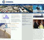
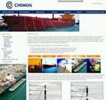
Time for another quick review: 15 minutes to assess Chemoil’s corporate website.

There is much to be commended in this site. Chemoil includes a number of items that many other companies fail to include, such as: video, podcast, webcast, a glossary, FAQs, third party comment, a sitemap, biographies of both board members and management, a dedicated shareholder page, details on insider trades and a good explanation of their business and strategy – as well as a great deal of other information.
However, the site overall does have a few flaws, and I have some suggestions for improvement.

General Comments
- The first thing to note is the Flash splash intro, which many people find frustrating. The first annoyance is that it is there at all; the second is that it doesn’t complete properly before the home page loads, but appears to end partway through. I would suggest eliminating it completely.
- A small Flash movie can add some vitality to a page, so I don’t have a problem with movies as a concept – but the small Flash movies playing at the top right of some pages are poorly looped. The start and finish images aren’t in the same place, so the image appears to jump on the page.
- Not all pages have one of these movies, and on some of them there is a space for the movie to be … but it isn’t there. I suggest making the static image span the full width on these pages (see the Marine Fuel page, for instance) as they do for the pages hosted by Listed Company.
- I also think that the images should be given alt text, particularly the images showing the increase in global demand over time, which demand some relevant explanation in the alt text.
- The home page has rather too much activity going on. There are two different sections with scrolling text – which is scrolling in different directions – as well as text movement in the Flash movie. A bit of movement can be really good at adding vibrancy and interest to a page, but perhaps not three on the same page.
About
- I suggest that there should be a warning on the Our Founder link that this brings up a PDF rather than an HTML page – PDFs can take a long time to load, particularly if the visitor is on dialup.
- There is a good explanation of the business in layman terms (for example on the Marine Fuels page). This could be expanded by adding a section on the issues that the market is currently facing, and the position of Chemoil within the market.
- Again, the Strategy section is good; my suggestion here would be to add some detail on specific targets for the next few years. Then, of course, Chemoil can add information about their progress against these targets.
- The dividend page has an Under Construction note, and no content. If a page isn’t yet ready for the public to see, I suggest keeping it hidden until it is. This does mean amending the navigation, but the image portrayed by an Under Construction page isn’t a great one.
- I suggest that adding a dedicated Investor Relations contact number would be helpful, and very easy to do.
- There is little interactivity, despite the webcasting, podcasting and video, though there is a navigational map and a rollover timeline. Chemoil could usefully add some investor tools, such as interactive charting, share calculators, share price history downloads, spreadsheet downloads and investment calculators.
- The pages hosted by Listed Company are the IR section and the press releases in the Media section. These are not consistent in that the left hand navigation vanishes in the Media section, but is present in the IR section (so it is possible for Listed Company to add it). Please add the navigation; consistency in navigation is very important.
- In the Media section, there is an Image Bank – great, I thought, let’s check if they’ve got the company logo (something that is often missing). Very oddly, there is a ‘search by quarter within year’ facility for the images … and no images available for viewing in any quarter of any year.
There are two problems with this: one is the lack of content (again, if there is no content yet, I suggest hiding the page from the public) and the time-based search. Using time as a basis to search for an image is odd – usually images are grouped by type: board members, locations, projects and products. How will a visiting journalist know to look in the third quarter of 2005?
- And I would suggest adding an RSS feed for the media releases at least to begin with – and perhaps expand this functionality later.
All in all, though, this is a site with a lot of relevant and useful content – it just needs to tidy up the Flash and the missing content, and perhaps add some more interactive tools.
Would you like your site given the 15 minute treatment? Let me know – send me an email.
Lucy is Editor at Corporate Eye


