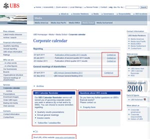
Getting users to think you are truly focused on customers / users can take a lot of work. Being extra helpful on the website can contribute to this. Even on a simple financial calendar, UBS offer:
- Contact us links for each event (we haven’t seen that before)
- An additional prompt for the user to think whether they have any questions with a link to an enquiry form
- Guidance for how to use the calendar reminder functionality
- A short, easy to remember url for the page e.g. www.ubs.com/calendar
We like this because:
Even if these features don’t get used much, it gives the user the strong feeling that UBS are trying to go the extra mile to be helpful to the website users.
See UBS Events
Author
Lucy is Editor at Corporate Eye
