On 19th September 2008 I realised something rather profound … I’m now a Lloyds TSB customer. Both my wife and I have always had a Halifax account (although it’s not my main one) but I’ve always had an aversion to Lloyds TSB.
Now the two are coming together to create the UK’s first SuperBank. For no other reason than this I’ve decided to jump on the bandwagon and make Banking, specifically Lloyds TSB and HBOS, the first of my FTSE 100 Website reviews.
There’ll be a Welcome on the Front Page …. ?
HBOS’ front page has four sections aimed at each class of visitor it believes it has: Customers, Investors, Journalists and “Just Looking” and looks quite good.
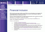
The main Corporate Responsibility section is under “Just Looking” along with other sustainability related sections. Additional sections on Responsible Lending and Transparency are under the Customer class.
I like the idea of having specific visitors sections: when done properly it helps the visitor find what they’re looking for without any mucking about.
However, it can also give an insight into what a company believes its visitors are interested in and what they would like to reveal to whom.
For instance, one could draw the conclusion HBOS Investors aren’t interested in Transparency or the institution’s Corporate Responsibility; an interesting, if worrying, observation.
In addition the entire section, including Climate Change, is classed as being part of the site’s Community content, leading to a suspicion of muddled thinking.
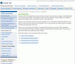
Lloyds TSB, in comparison, has no sustainability content on its front page. It can be found underneath the About Us section, which itself takes a bit of hunting to find.
So, the conclusion could be reached that Lloyds TSB believe very few of their visitors have any interest in sustainability. Another interesting, if worrying, observation.
The HBOS Sustainability Sections
The in depth sections of both websites are very dry and uninformative. Both have links out to PDF documents; in HBOS’ case these are mainly reports and reviews while Lloyds TSB adds a good few policies to the mix.
However, a further insight into HBOS’ attitude can be gleaned from its “The Way We Do Business” statement. This says:
“our main contribution to society is the value we can add through our success in business … we will observe the laws and regulations of all countries within which we operate”
This is very disappointing. It shows the bank, the largest UK mortgage lender, simply doesn’t know how to differentiate itself from its competitors.
Further details on the website confirm this. It mentions sponsorship deals for grassroots sports; leadership in social banking; supporting micro financing in the UK and the adoption of the Equator Principles.
But none of these have informative descriptions of what the initiatives are or the proper profiling of leading projects and case studies. They’re simply mentioned in passing.
The Lloyds TSB Sustainability Sections
As mentioned above, the Lloyds TSB website suffers from the same basic problem as the HBOS one: very dry in tone with an over reliance on information stored in external PDF documents.
That said, the company should be applauded for making a range of sustainability policies available online. Transparency is one of the key points of the sustainability agenda and is needed now more than ever when confidence in business is, er, plummeting.
However, the comparability with HBOS continues in other ways. For instance, there are four Lloyds TSB charitable foundations, with different regional responsibilities across the UK and Channel Islands.
Also, the bank publishes its mystery shopper results and is the only UK bank to have achieved the Royal National Institute for the Deaf’s “Louder Than Words” standard.
All of could have been presented in a manner to engage the visitor and educate them about the efforts Lloyds TSB are making towards creating a sustainable economy.
Instead, the bank has adopted the same bored tone as HBOS, giving the impression that it’s only doing this as a matter of course and without any real commitment.
But the curtains are a different colour!
The one differentiation between the two sites is in the layout and navigation. HBOS’ is, for such a major company, poor to say the least.
For starters, the section headings are too large and the colours too bold, all of which leads to eye strain when refocusing on the smaller font of the main content.
Navigation is confusing as well, with sub sections displayed underneath the main section menu in the left hand margins, other links sometimes popping up on the right hand side, a badly implemented breadcrumb trail and at least one broken link.
On the other hand, the Lloyds TSB’s website is much more pleasing on the eye with a better navigation system and a more relaxing use of fonts and colours.
It is, however, rather disheartening to realise that window dressing is the main difference between the two-soon-to-be-one institutions. It’s also a shame because a bit of digging gives the impression there may be several great stories to tell.
However, if the banks aren’t going to put the effort in to tell those stories, one could also conclude it’s all nothing but greenwash. How very disappointing.
Dinner tonight in the Milton household will include a discussion on where the family’s bank accounts ought to be: a life changing event, all because of a couple of website reviews.
A former CTO, Chris has a broad and varied background. He’s been involved with blue chips, consultancies & SMEs across a wide variety of sectors and has worked in Europe, the Middle East and Australia.
In 2007 he decided to combine his knowledge of business and IT with his passion for all things sustainable and has been busy writing ever since. However, his greatest ambition remains to brew the perfect cup of coffee.


I think that most of UK corporations website are found lacking,there seems to be is a culture of indifference towards web design.