
My first reaction to the new Vancouver Convention Center logo when I saw it on the Brand New blog was — yikes, that looks really cold! I suppose that makes sense, because it certainly is cold in Vancouver, however, in my mind, that translates into — I don’t want to go there. I’m assuming that’s not the message the Vancouver Convention Center wants to send out. But enough about my hatred of all things cold. Let’s get back to branding.
When I look at the new Vancouver Convention Center logo, a few red flags are immediately raised:
- This logo will be a b*!ch to reproduce in a variety of formats. Think of the standard corporate giveaways such as embroidered golf shirts, hot stamped coffee mugs, and so on. Forget the occasional half tone. This logo is ALL half tones!
- This logo would have worked well for the Titanic.
- This logo looks like someone used Word Art in PowerPoint with a standard texture applied to it.
- This logo looks a lot like the logo and title page for Deadliest Catch on the Discovery Channel. I love that show, but I don’t love this logo.
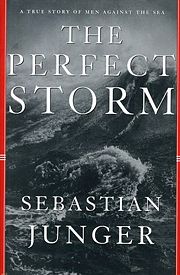
- This logo reminds me of the cover to The Perfect Storm by Sebastian Junger.

Perhaps I’m being overly critical, but this effort seems like yet another rebranding effort that cost a lot of money gone terribly wrong.
Your thoughts?
 There is no denying the statistics that repeatedly tell us mothers are one of the most powerful and influential consumer groups. A new study from
 I’m a big
  Twitter