Where better to search for good Investor Relations web sites than tech companies? These are supposed to be the companies that are cutting edge when it comes to technology and my thinking is that such companies, if anyone, will know how to optimize the web experience for their investors. So to begin my semi-random, completely unscientific review of how company web pages treat their investors, I decided to start by looking at how three well known technology companies – Microsoft, Apple and Sun – deal with getting investors to the appropriate spot on their web sites. Each of the web experiences says something instructive about the companies and I will deal with each in separate posts.
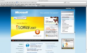
I started with Microsoft; they’re the big dog and their advertising is always telling me how their software will make my life easier. When I directed my browser to go to www.microsoft.com, instead of just the home page I encountered the home page with a pop-up window encouraging me to install a piece of software called silverlight in order to make my web experience better. YUK! As an investor, I want information quickly, and I don’t want software. Once I declined the software, it was relatively easy to find a link for About Microsoft in the upper right of the screen.

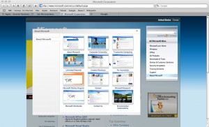
Clicking on the About Microsoft link brought up a new pop up screen showing mini views of a number of pages, including Investor Relations, For Journalists, Environmental Sustainability and 9 other pages. A further click on the IR page got me where I wanted to go. And I must admit, the mini pages were a cool touch.

Which leads me to introduce my entirely arbitrary ranking system for ease of getting to the investor relations web page on a company’s web site. In addition to the criteria I laid out in my previous post -number of clicks, treasure hunt component and location and size of the reference (see You Can’t Get There From Here) I will also consider obstacles placed in my path and general aesthetics. Based on a scale of 1 to 10, with 10 being the highest, I score Microsoft’s experience a 7, with markdowns coming from the blasted software pop-up, the listing for About Microsoft being in small print and the fact that it took three clicks to get where I wanted to go, one more than it should. (Note: A subsequent visit to the Microsoft site to double-check my findings revealed that Microsoft had removed the pop-up window for silverlight software and replaced it with a tab which people could access if they wanted the software. Without the software, I improve their score to an 8.)
What does all of this tell me, as an investor, about Microsoft? Well, to start, it shows they are willing to try to impose and tie you into new software. It might also tell you that they think current web browsers, of which they have about an 80% market share, are not doing certain things as well as they should. Judging from the home page and the size and placement of the About Microsoft link, product is what they overwhelmingly care about most. Finally, when you get to the mini pages view, investors are only one of many stakeholders.
It could be that I am reading too much into a series of web pages, but I assure that I will not be the only one doing this. When investors visit you, whether in person or virtually, everything is scrutinized.
