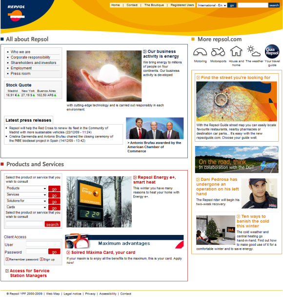
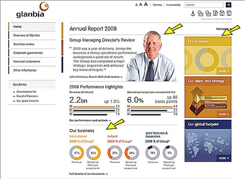
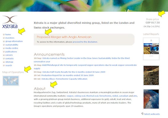
Some companies understand the value of a well designed content rich corporate website. Repsol, a Madrid based energy company, understands this very well. Their homepage is an engaging array of content–
Seldom have I seen such an entertaining, informative and well designed corporate website. Some observations–
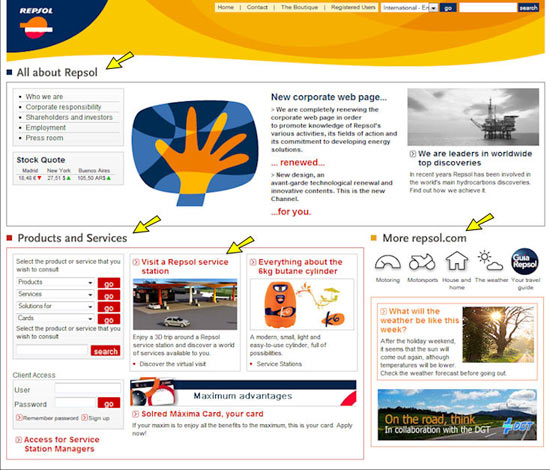
- Quick access to more information about the company
- Same for products and services
- A 3D tour of a service station
- More information for the visitor
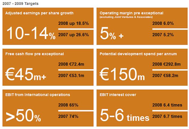
Next take a look at the Who we are section and you will see an interactive section —

Abstract art, yes but when you move the mouse over the diagram you will see more specifics about the company–
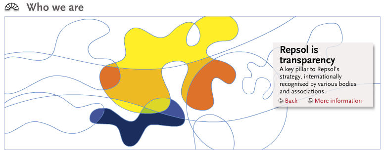
Simply put this is innovative and a uniquely entertaining method of presenting company information. But there are more innovations on this site. For example, visit the Strategy section to see a lively and interesting display of the companies strategy out to 2012.
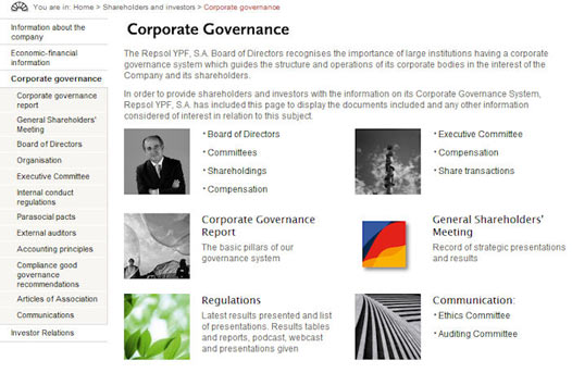
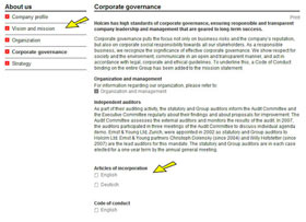
Next the Corporate Governance section–
Note the extensive menu on the left and the comprehensive display of Corporate Governance issues. Well designed, eye appeal and just about anything you need to see about Corporate Governance.
Bravo to Repsol for communicating with stakeholders in an engaging manner.
Note from Editor: Ed wrote this post some time ago, but it got missed in the publication queue. Here’s what the Repsol home page looks like today – you’ll see that it has been updated with content which reflects the current season (snow!) and is still bright, engaging and colourful:
