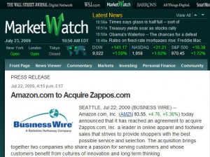
Names say a lot. “Amazon” is the name of a really big river and “Zappos” (even though it’s actually a derivation of zapatos, the Spanish word for shoes) has the flavor of a comic strip exclamation. Zap-wow!
Or it could sound like “zippy”–which certainly captures the brand personality of scrappy little Zappos, the company that took a whimsical idea like buying shoes online and turned it into a retail charm offensive. Zappos has become a marketing star by virtue of its quirky style and wide-open spigot of corporate communications.
For an example of the latter, just see this pages-long memo on the recent acquisition, which promises that the Zappos culture won’t change. And if you need a refresher on the Zappos culture, just check out their famous Core Values, or visit Fun & A Little Weird!, “The Inside Zappos Blog.”
It’s hard to believe there won’t be some culture effects at Zappos when the river rolls in, but that remains to be seen. In the meantime, let’s take a look at their respective approaches to recruiting.
And Amazon:
Let’s look again!
That may not need much commenting, but just in case . . .
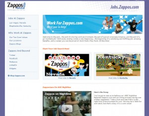
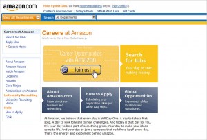
Both use similar color schemes (the always-safe “blue plus bright”) and a grid layout. But there the similarities end. The Zappos page is full of energy and playfulness, the Amazon page is full of–well, it’s not full of anything. In fact it’s rather empty, from a visual standpoint. (I didn’t show the full screen proportion, but there is even more white space to the right.) And from a content standpoint, there’s no information (really, none)–just labels.
Okay, there’s a paragraph of text. But I would describe it as empty of content. There are 71 words, and 8 of them are “day.” The 71 words are divided into 8 sentences, all but one containing the word “day.” Here’s an example: “And your day to join a company that redefines itself every day.” And here’s another: “It’s your day to be a part of something great.”
This dogged repetition might have seemed rhythmic if chanted, but it really doesn’t work well as a passive block of text on a white page. It actually reminds the reader of something robotic–and while that might connect up with Amazon’s great approach to automation, I don’t think that was the intent.
Back at Zappos, there’s not much text either (56 words in 2 long sentences, plus three exhortatory fragments). But it’s definitely not robotic. And it delivers a focused message: Zappos is not an ordinary company and it’s fun to work here.
Whereas . . . the message I took away from the Amazon page was “No one cares about this message (or this page) very much.”
To be fair, the goal at Amazon may have been to create a pleasant, professional appearance and tone, with a clean look and feel–and there may be reason to think that would work effectively in terms of its target audience and employer brand. But the Amazon tagline is actually very similar to Zappos (at Zappos it’s “Work Hard. Play Hard. All the time!” and at Amazon, it’s “Work hard. Have fun. Make history.”), so we have to ask: Which site delivers that message more successfully?
And two final points: The Zappos page has social media links, the Amazon page does not. The Zappos page has a video, the Amazon page does not. Inevitable impression? Zappos is on top of the times, while Amazon is lingering a bit behind.
Let’s see what happens when the waters rise.
