Looking for some insights into website design, I found myself time-traveling back to 2005. That was the year two well-publicized studies appeared: one on first impressions, the other on gender preferences. Although there have probably been some shifts in the meantime—as more people (and especially more women) have spent more time on more websites—the basic findings of these two studies almost surely continue to offer useful information.
First: The Human Oriented Technology (HOT) lab at Canada’s Carleton University found that people made their judgments about a site in 50 milliseconds—and those judgments did not change much with extended viewing. (Here’s a BBC summary of the HOT study.)
Obviously that instantaneous impression is created by the graphic design, not by usefulness of content or ease of navigation. It turns out, however, that the initial pre-cognitive response creates a “halo effect” which carries over into the visitor’s perceptions about everything else on the site. So a positive first impression creates positive expectations—and since people like to be right, they tend to continue reinforcing their own opinions.
The HOT study does not provide details about just what attracted/repulsed test subjects. When viewers spent a longer time looking at the sites, they were asked to rate on broad categories such as “interesting/boring” and “good design/bad design.” So the major takeaway from this study is . . . whatever you do, it had better work really fast.
Second: A study at the University of Glamorgan found significant differences in site design preferences between women and men. (Here’s a BBC summary of the Glamorgan study and here’s the more detailed Glamorgan account.) Generally, men preferred straight lines and formal language, while women liked rounded shapes, more color, and informal language. That in itself may not seem too surprising, but the study also found something we might not have anticipated. When asked to evaluate the websites of more than thirty websites from higher education institutions, the male test subjects preferred sites designed by men, and the women preferred sites designed by women.
Problem? Most of the websites (92%) were designed along the “masculine appeal” lines by male web designers.
It’s important to note that the websites evaluated in the study were academic institutions—which typically have the need to attract people of both genders. And in that, they are very like the corporate Careers site.
Once I started thinking about this, I realized that a substantial majority of the Careers sites I visit are arranged on a straight-line grid, with a limited palette and a fairly formal approach to language. Put another way: they are designed to appeal to men. And that may be why I (not a man) find so few that really appeal to me.
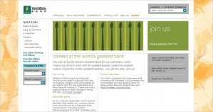
For example . . . this probably accounts for why I especially like the Umpqua Bank site. It is very slightly feminine. Not, I think, in a way that would offend men, but there is a bit of curviness (subtly placed in the background pattern) and the design is more colorful and less formal than the majority of sites.
Obviously, what’s wanted is balance. So consider whether the landing page for your company’s Careers site offers visual elements that appeal to women as well as men—in one-twentieth of a second.


