Ever since Fred Astaire turned Audrey Hepburn from a bookworm to a cover girl in Funny Face, the makeover has been a Hollywood staple. And more recently, a great source of ratings for reality TV. Although a website transformation doesn’t have quite the same level of drama, it can still be entertaining—and instructive.
So here we have two makeover stories, both of which show what a difference design can make. But while one is a clear winner, I’m perplexed about the other.
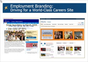
Let’s start with the unambiguous improvements made by DaVita early in 2008. It was a perfect case study, with statistics to back up the effectiveness of the new design. Within a year, site visits were up 88%, unique visitors up 76%, return visitors up 128%–and applications up 97%.
DaVita, a Fortune 500 company, is the largest independent “kidney care” (aka dialysis) company in the US, employing more than 33,000 “teammates.” Also—winner of the 2009 ERE award for Recruiting Department of the Year, which makes the makeover worth a revisit. For a fairly detailed presentation of DaVita’s approach to talent acquisition, watch this slideshow.
Here’s the single slide from that presentation which deals with the website:
Although the build text left on the published presentation makes it a little hard to see the old site, this side-by-side depiction of the old and new website designs clearly shows the increase in visual interest. The lively new look features lots of people, along with clearly marked one-click paths to high-interest content.
The makeover goes beyond just improving look-and-feel qualities. A big addition to the new site is a “Life in the Village” tab that focuses on this core message: “The DaVita Community is a unique place where we care for our patients, each other and our world.” One of the components is a Community and Charity section that goes far beyond the token presentations found on many sites. DaVita organizes its wide-ranging collection of Village programs into three tabs (“Each Other,” “Patients,” and “The World”), ranging from employee recognition plans to clinical research grants to Bridge of Life, the medical missions program that “allows teammates to bring quality dialysis care to underserved regions, such as Africa, Latin America and Asia.”
With a full complement of social media connections, video tours, You Tube links, and other modern must-haves, DaVita touches all the bases nicely. And it does so with a clean look that is cheerful without being frivolous.
Turning to the other makeover . . .
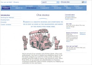
Earlier this year I picked the education/publishing company Pearson as one of the websites that charmed me unexpectedly. It wasn’t slick and didn’t have all the bells and whistles we’ve come to expect—but it had an authentic, quirky feel. Here’s how the “Our People” page looked in March:
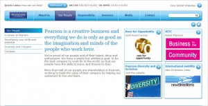
As to whether this is an improvement, I think it depends on what measures you use. The page is a component of a whole new site design that flows along a sort of bright, contemporary line—and there’s no doubt it looks more up-to-date and offers better functionality. But it also seems generic. The headline text on this page still emphasizes creativity and imagination, yet (to my eye, anyway) the design does not reinforce that message. Perhaps there could have been a more engaging approach to modernization?
I’d love to hear other opinions!
