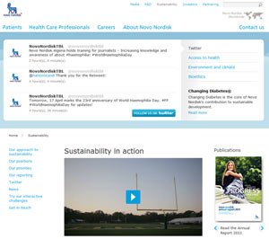
 Unusually, Novo Nordisk have embedded their Twitter feed into the hero slot at the top of their Sustainability section. If included at all, this is usually in the sidebar or in the footer.
The emphasis indicates the importance to Novo Nordisk of communicating with stakeholders – and dramatically draws attention to their Twitter feed. Only the last three tweets are included, which means the font used can be large, with plenty of whitespace.
And, of course, it makes a change from big hero images…
 New research
 Google+ isn’t even a year old yet and Brand Pages have only been around since November 2011, but already, brands are seeing user engagement on Google+ according to research by
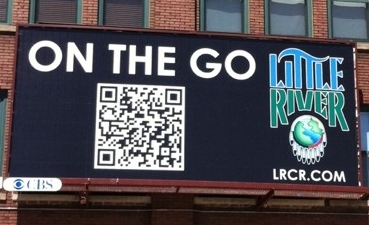 The use of mobile barcodes (primarily Quick Response codes, known as QR codes) has grown significantly over the past year with